Your infographic is too text-heavy
Content
September 25, 2019
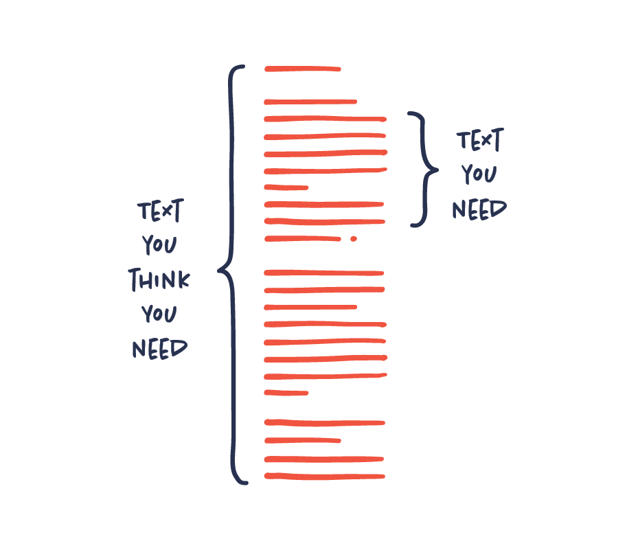
Nobody wants to read an infographic that is text-heavy. It kind of ruins the whole point of having an infographic in the first place.
Aim to use as little text as possible. In most cases, the less text you need to communicate your message the better. If you feel like you need a lot of text to get your message across, it may in fact point to a problem with your infographic.