6 information design trends in 2025 to keep an eye on
We have gathered the six most important and intriguing trends in information design for the year to come.
The new year is knocking on the door. Do you need to keep your visual toolbox up to speed? Here are 5 visual communication trends in 2025 to look out for!
TREND #1
Data and photo merge
A relatively new concept in infographics is the fusion of data and photos. As seen below, compelling narratives emerge when data is conveyed through edited images. The use of authentic photos frames the stories in a recognisable and relevant context. Meanwhile, this concept stands out significantly from more traditional data visualisation, making it particularly impactful on social media, where attention needs to be captured in a busy feed.
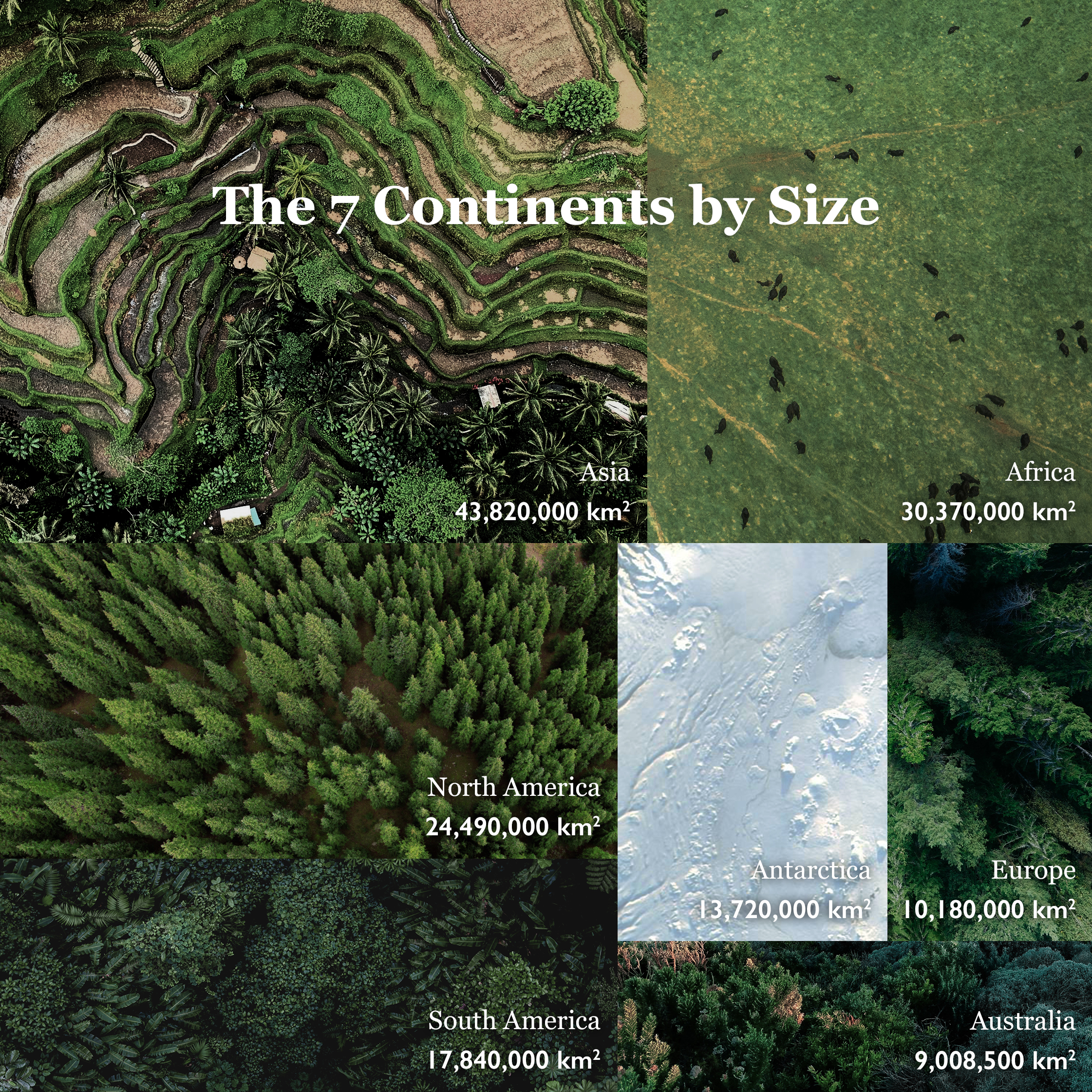
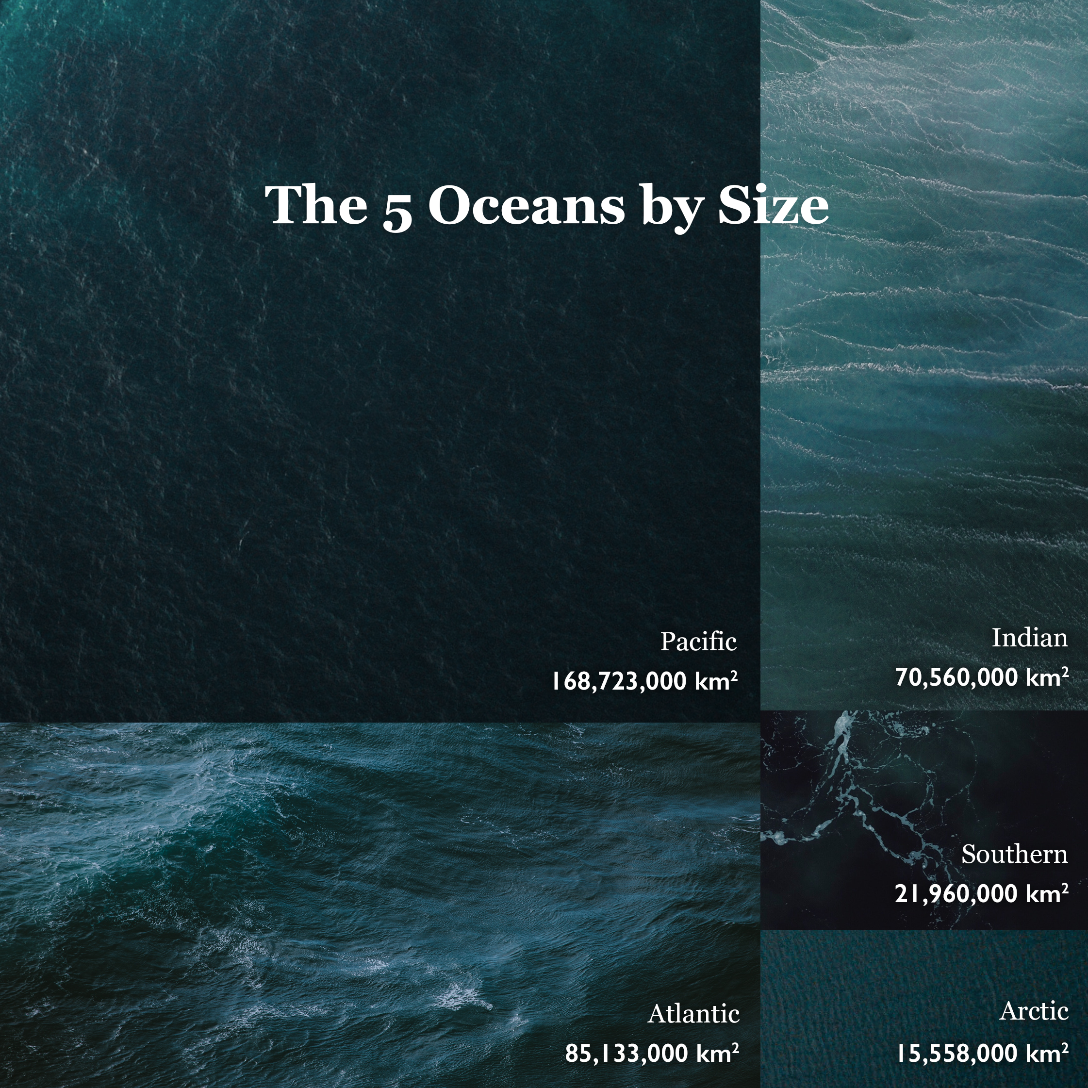
Captivating stories unfold when data meets the lens.
Data visualisation by Ferdio
TREND #2
Short animations, big impact
“Long” animations of 1-2 minutes are often referred to as the golden standard for explainer videos. However, not all content fits into these formats. Shorter animations, typically 5-20 seconds for the web and social media, are gaining popularity. This concise format blends the best of two worlds, capturing attention and providing high visibility. A clear advantage is the low production costs. Additionally, social media platforms like LinkedIn, TikTok, X and Instagram have made it easier to publish these.
Fra @exeasy.kris
TREND #3
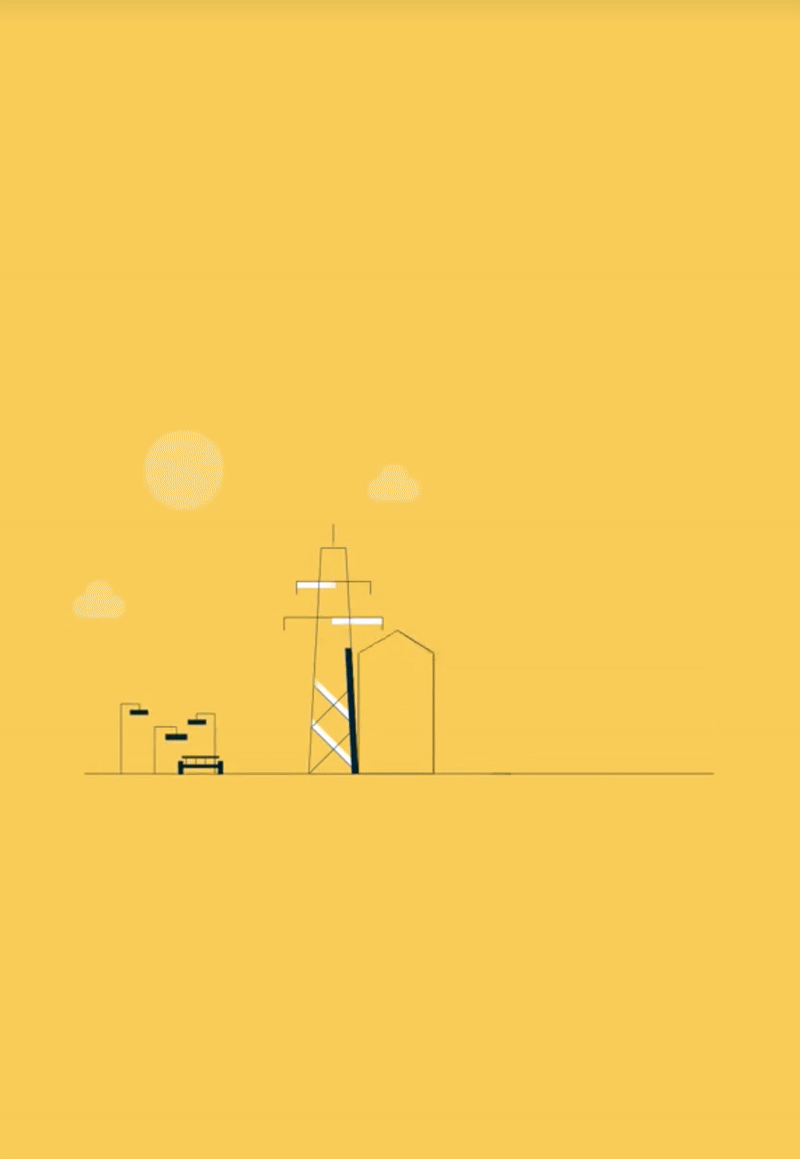
Film and animation unite
Sometimes classic film has the strongest impact, while other times animation is the best solution. How about combining the best of both worlds in one video? This blended approach is currently gaining traction in various forms, where location-based or studio recordings are enhanced with animated elements.
Q CTRL – Educational Animation Series
TREND #4
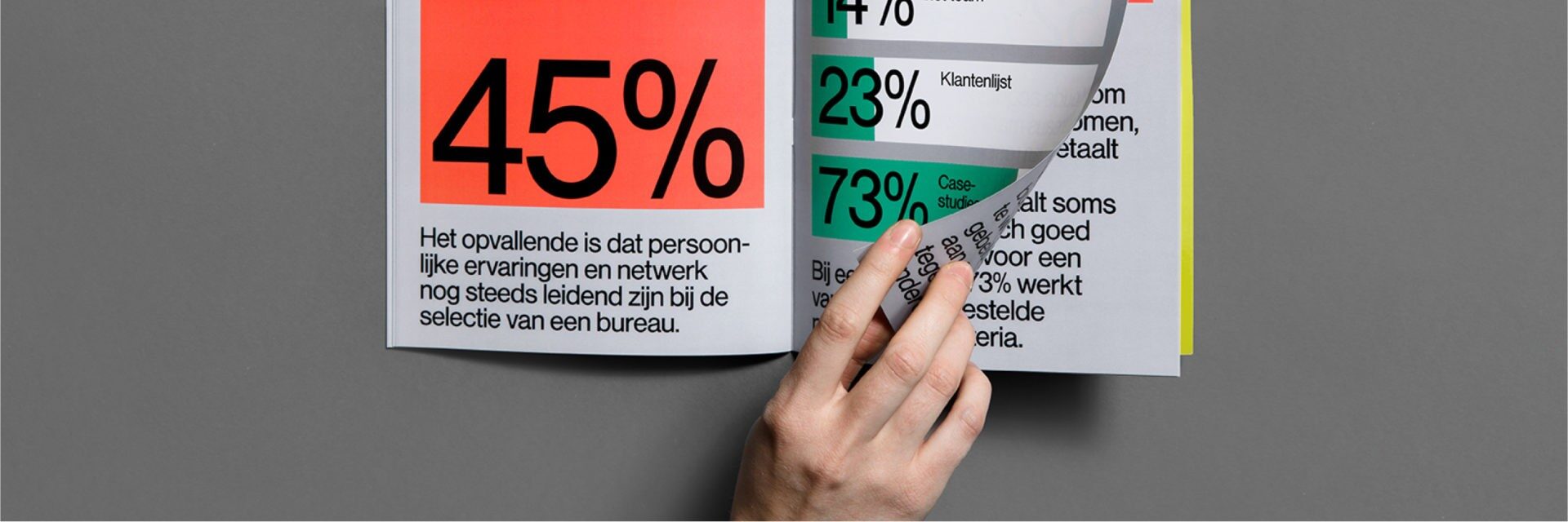
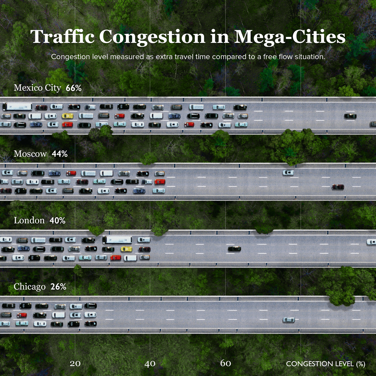
Cognitive simplicity
We all know the design mantra “less is more”, so why not apply it to data visualisation too? A growing trend today embraces bold simplicity, focusing on clean visuals that are both minimal and impactful. Rooted in Gestalt principles, this approach emphasises clarity, visual hierarchy, and thoughtful color choices, making cognitive simplicity a key pillar of contemporary data design.

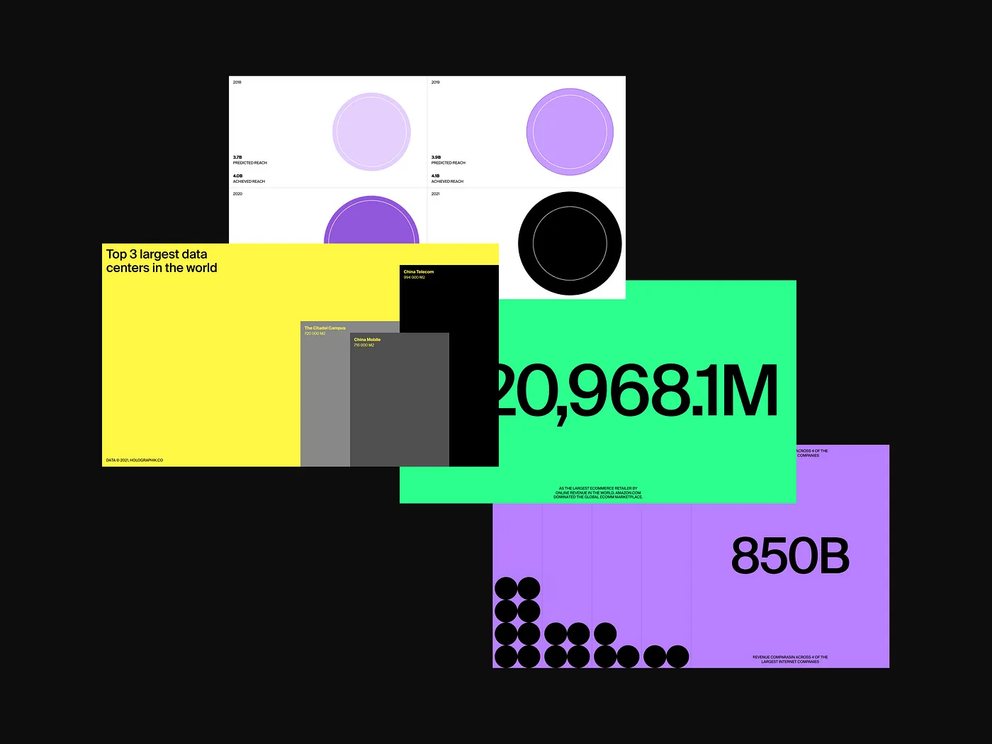
Compelling data visualisations merging bold colours and shapes with essential and effective typography.
Infographics by Studio Gretel – HOLOGRAPHIK Studio – Studio Size
TREND #5
Data as physical objects
Using physical objects to visualize data is another creative approach that can make content more effective and tangible in many situations. The possibilities are numerous, as demonstrated below in various contexts for both social media and exhibitions.
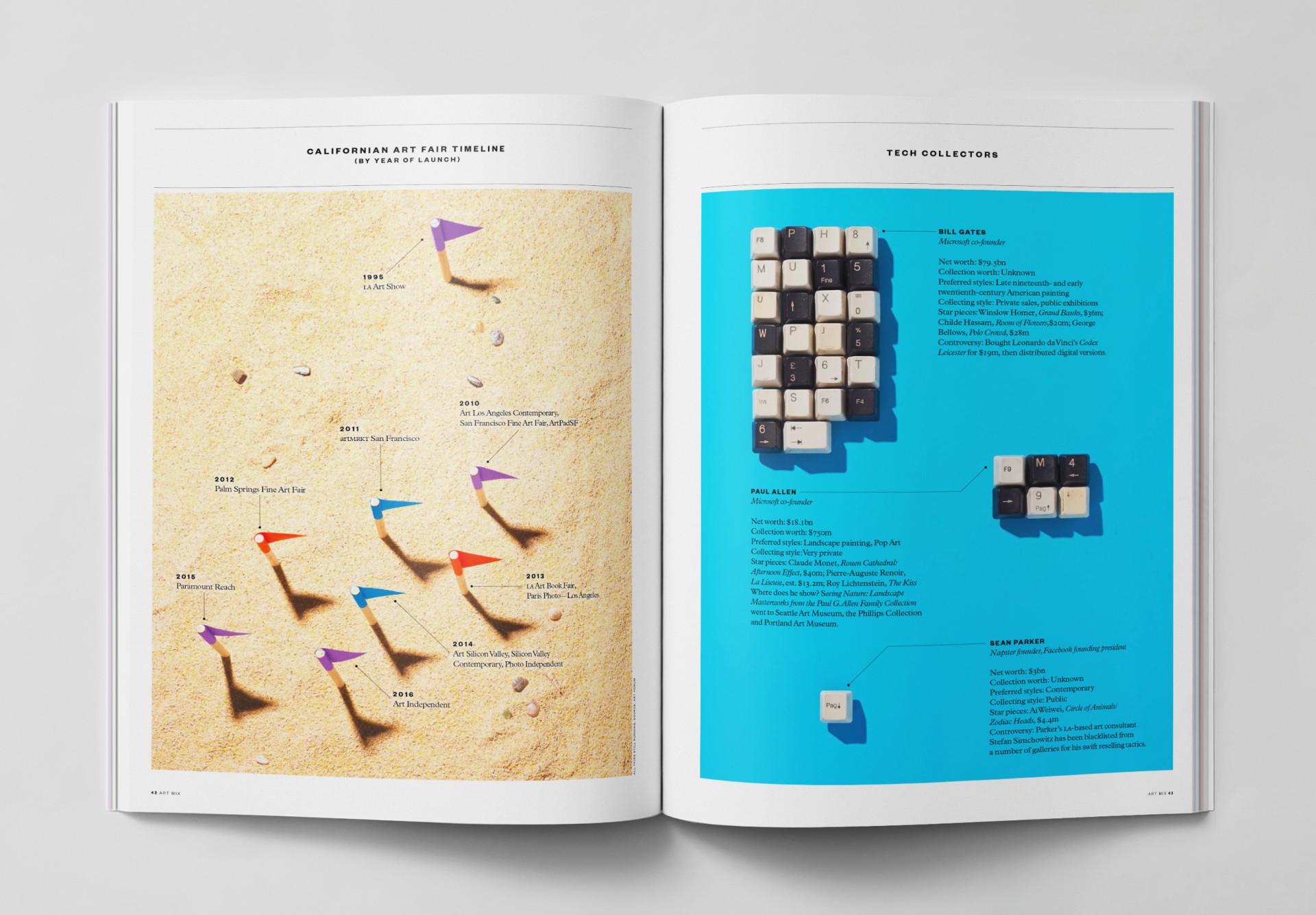
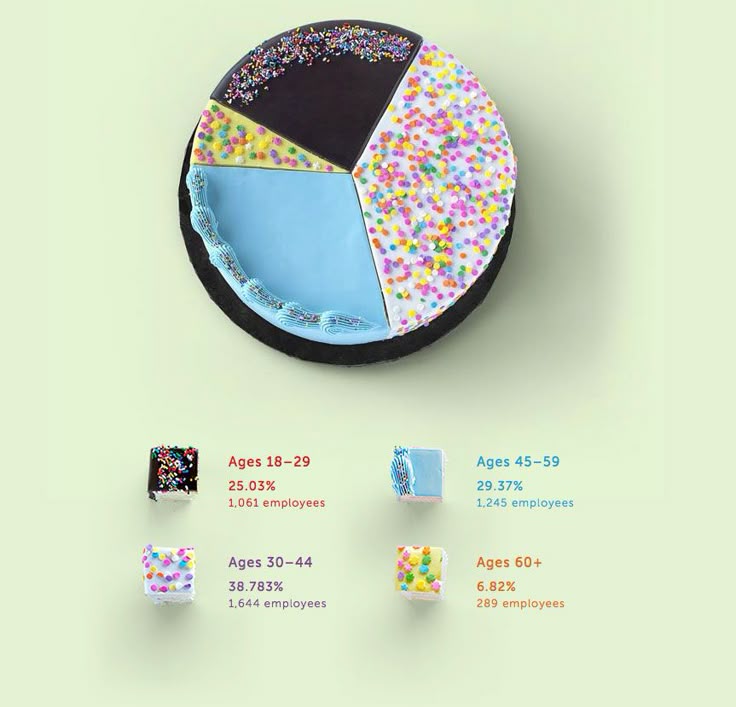
By LA TIGRE – Elephant Magazine
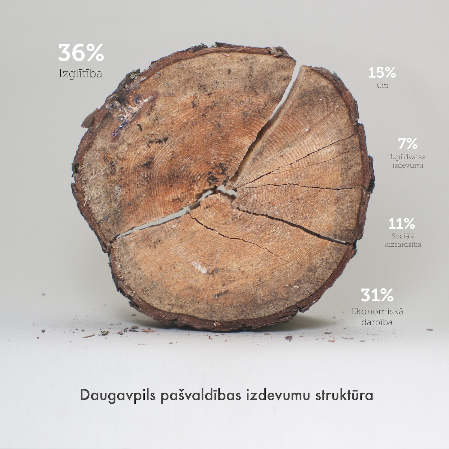
Real objects as charts and diagrams
TREND #6
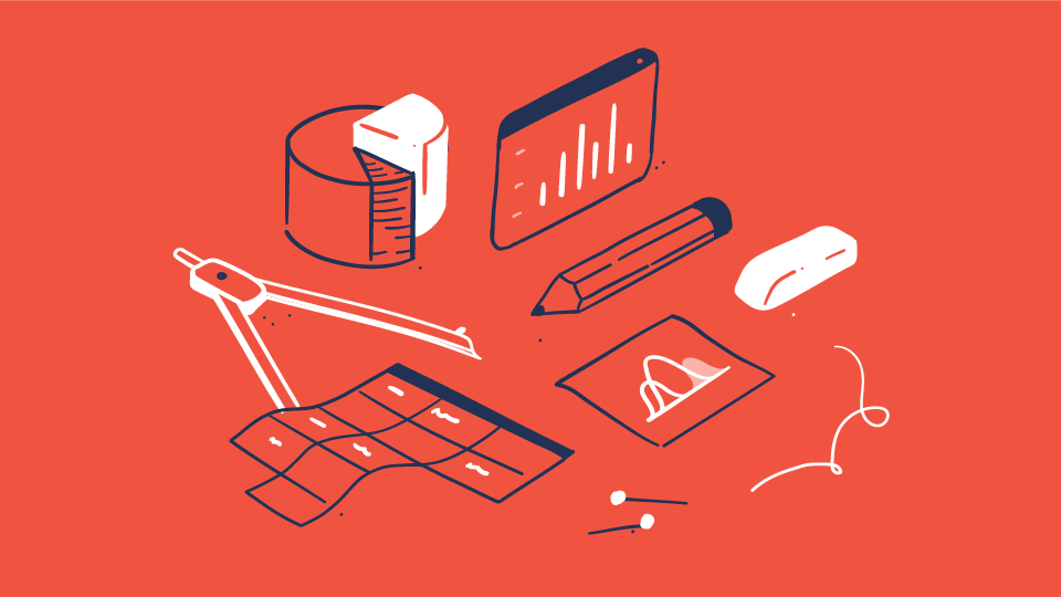
Data drawn by hand
Data visualization is often created digitally in programs that can transform data into elegant and polished visuals – if you know how. However, classic data visualizations can sometimes appear dull and cold. Hence, a counter-trend involves hand-drawn and analog data visualizations, contributing to a more exploratory, personal, and imperfect communication of data. After all, both data and its visualization are ultimately human-made and therefore imperfect. It makes sense for data visualization to express this.
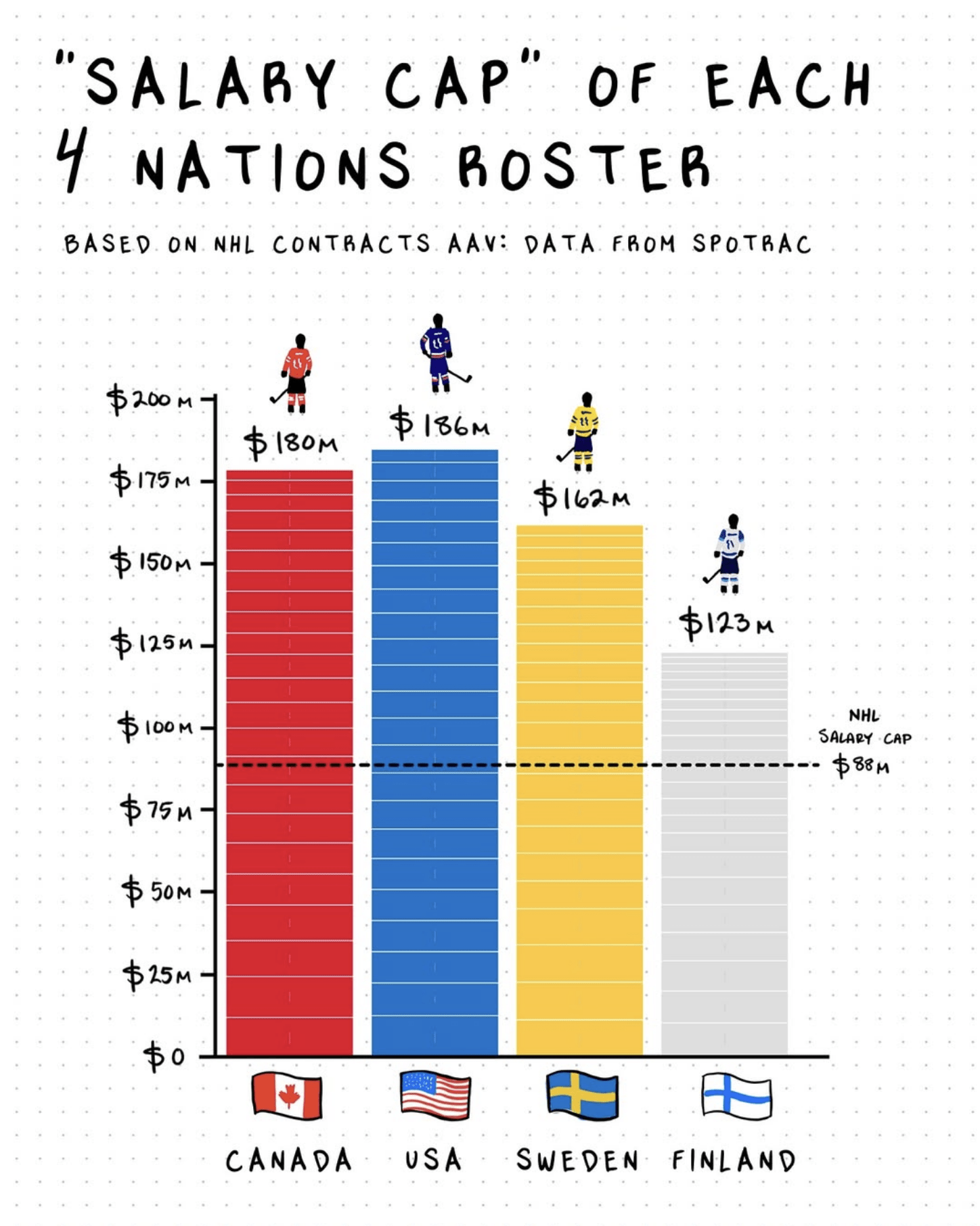
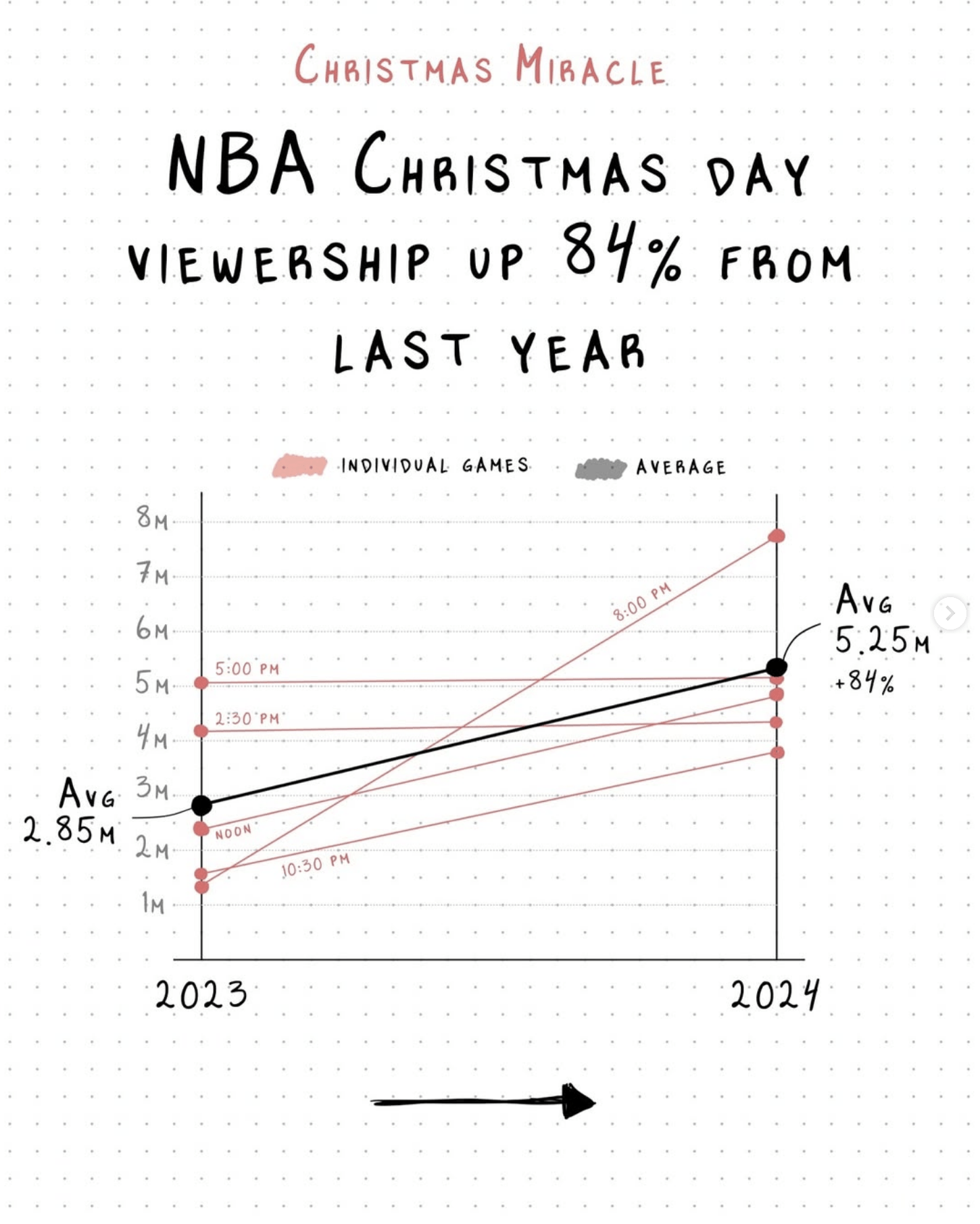
Adding a touch of exploration and imperfection to data through hand-drawn visuals.
From @_sportsball
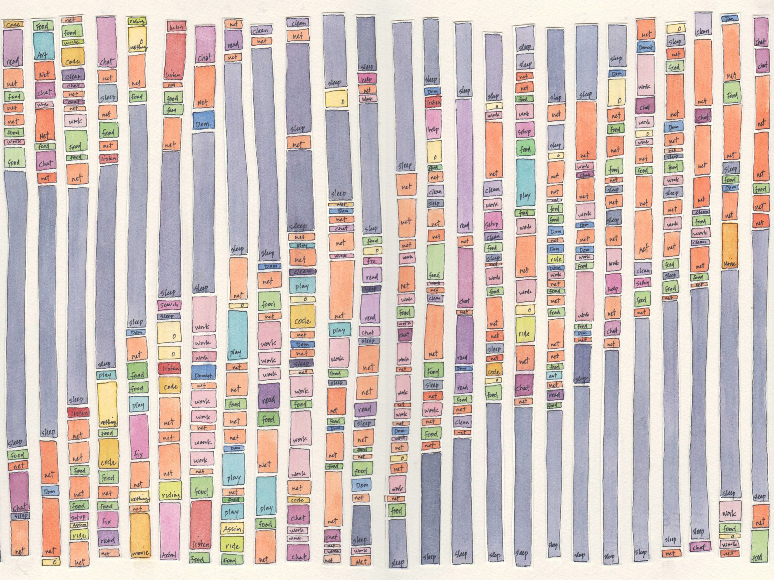
From @lauriefrick
These are our predictions for visual communication trends 2025. Do you want to know more about how you utilize your data and information to create impactful communication? Do not hesitate to reach out. This is exactly what we do.