8 most important lessons from working with data visualisation for more than a decade
A curated compilation of the most essential insights for making compelling and purposeful data visualisation from a specialist agency.

Data visualisation holds the power to unlock insights and drive understanding in ways that raw data simply can’t. Data visualisation is the art and science of turning data into visuals you can understand, remember and relate to. And to us the beauty of the work is exactly that it both includes skills and understanding for art and science. That’s also why best practice will get you far, but not all the way. It’s not just about learning how to use different charting tools, understanding the do’s and dont’s and mastering the basic design skills. There is more to it than that; It’s about developing a way of thinking – and not everything can be taught. Some things have to be experienced.
We’ve been working in the field of infographics and data visualisation for more than a decade now. We have spent most of our days turning data and information into powerful visual communication.
This article is written with the intention of sharing the most essential advice that could help you start thinking about data and visual . It’s a collection of the advice we have used ourselves the most, continuously over the years.
blends analytical rigor with creative communication. It’s a mindset that constantly seeks to understand, interpret, and then clearly convey insights hidden within data.
You might not agree with everything, so feel free to start compiling your own advice.
It is often considered a very pragmatic discipline that is all about efficiency. WhichBut in our point of view
We’ve failed. We’ve succeeded. But most importantly, we’ve learned.
At some point we started to compile all the most important lessons we’ve learned in a little notebook – as a way to get smarter and make sure we didn’t repeat the same mistakes over and over. A few notes quickly became a lot, and our notebook was born.
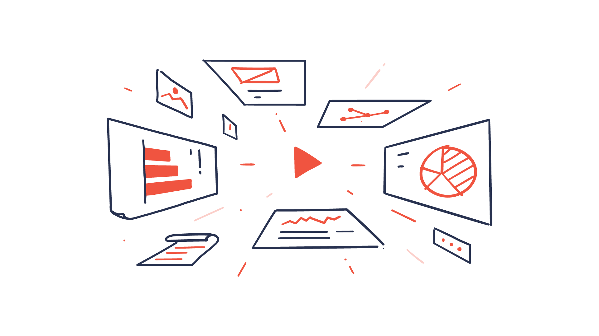
Use and exploit your basic visual toolbox
Data visualisation is all about converting data into meaningful and effective visual representations. In order to do so, you need to become familiar with your toolbox of visual assets like size, color, direction, etc. Don’t use all at once but choose and experiment to find the most effective for the task.

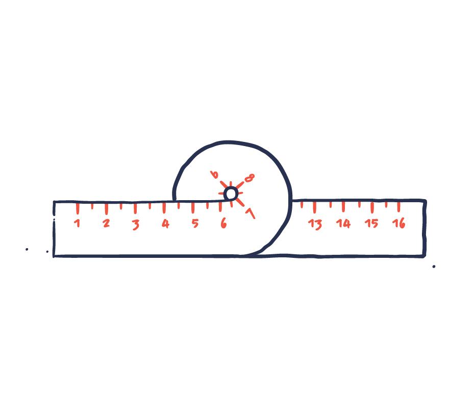
Follow the rules, bend the rules
You need to know and master the basic rules and best practice for data visualization. But there are always exceptions to the rules. There will often be cases or circumstances where you need to bend the rules – or even ignore them —to achieve the best results. The art is to know when to follow the rules and when to bend them. Start by the following the rules and only bend them when it is necessary to communicate your message better and more effectively
Simple ≠ simplistic
We aim to make complex information simple and easy to understand. That’s simplicity: when you can identify what’s essential and eliminate the rest. Simplistic on the other hand is when you treat complex issues as if they were much simpler than they are. There’s a clear distinction. Complexity is never eliminated but can only be reduced or concealed. Or in the words of Albert Einstein:
“Everything should be as simple as possible, but not simpler”.

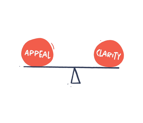
Balance appeal and clarity
Your visuals should be concise and easy to understand. You also want your visuals to be appealing, interesting and able to evoke emotions. Appeal and clarity are not contradictive. But sometimes more clarity can lead to less appeal and vice versa. It is your job to balance the two in order to make truly appealing and concise visual communication.
Love your spreadsheets
Don’t be afraid of the spreadsheet. It can be just as much of a playground as your Adobe Suite. This is where you find patterns, organise your content and discover great stories. You might not be a data analyst, but data curiosity and an analytic way of thinking are key when it comes to creating great information design.
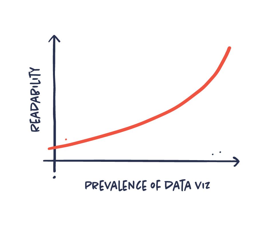
Use common data visualisations for common understanding
Information designers sometimes tend to favor more exotic and artistic data viz types. Though this can be inspiring and useful, it is important to be aware of the readability and function of the chart types. Basic data visualisations like a bar chart or a line graph work because everyone knows how to read them. Choose the data viz type that conveys the message the best and the one that your audience will understand.
Dig deep to identify the essence
The pile of information on your subject may be extensive and you need to dig a lot before actually finding what you’re looking for. This dirty work includes everything from arranging and researching to identifying and prioritising the information. All this work can be time-consuming, but necessary in order to extract just the information you need for making concise and powerful information design.

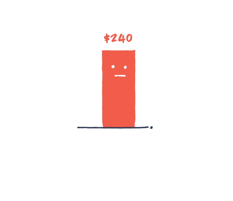
Put numbers in context. Always.
Data without context leaves the reader wondering. Is it a high number? Is it low? Good? Bad? The context will tell your audience whether the sales figures shown should be perceived in a positive or negative light. Everything’s relative, so we always need some kind of context in order to understand a number.
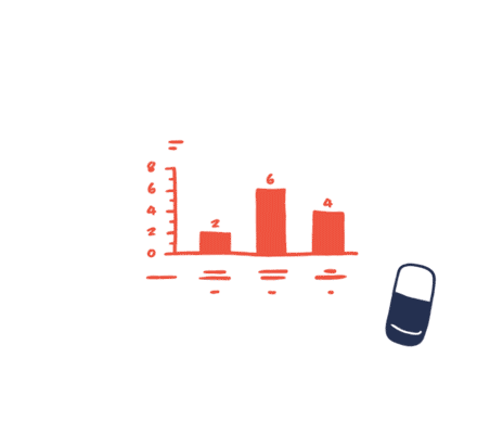
Leave out superfluous information
Data visualizations are often more complex than they need to be: A way to detailed axis, fine meshed grid lines that are unnecessary or additional technical details that just blur the core message. The more superfluous information you include, the harder it is to decode the information and the key message. Leave out all superfluous information and include only the information necessary or helpful for comprehension.
Your tools should not decide what your visual should look like
In recent years, we have been flooded with amazing new data visualization tools. It is easier than ever before to exploit these tools. They are often used to make advanced and heavy data viz that would have been almost impossible to make before. But just because it is possible, doesn’t mean that it’s a good idea. The story you want to tell should decide how you visualize your data not your tools. The visualization should underline your story and not be more complex than necessary to communicate the message.
Above all, be trustworthy
Your audience must rely on your information and trust that it is credible.Trustworthiness and authority should be present in your sources, your data, your visualizations and your design. Treat your data and sources with respect. Don’t be cocky, frivolous or too simplistic, as it will make your data visualization lose authority and trustworthiness.

Data is imperfect
Let’s just stop thinking data is perfect. Data is primarily human-made. “Data-driven” doesn’t mean “unmistakably true,” and it never did. That’s why working with data and communication data requires an even greater sense of responsibility. Treat data with respect and remember that it’s not perfect.

For more advice check out our full notebook. All hard-earned insights about information design and data visualisationdesign. Hands-on, honest and condensed – from 10+ years of experience.