Everything you need to know about infographics
A short introduction to the what, why and where of infographics.
The popularity of the infographic has risen dramatically over the past few years. You see them everywhere, in your SoMe feed, the slides at the conference, in the news or the annual report. They are a powerful means of communication and many companies use them actively. But it is crucial to consider where, why and how you use them.
Let us explore what infographics are, where they can be used and how they are used in an effective and impactful way.
What is an infographic?
An infographic is a visual representation of information. The word itself is a combination of information and graphics. According to Wikipedia, infographics are simply defined as visual representations of information, data, or knowledge.
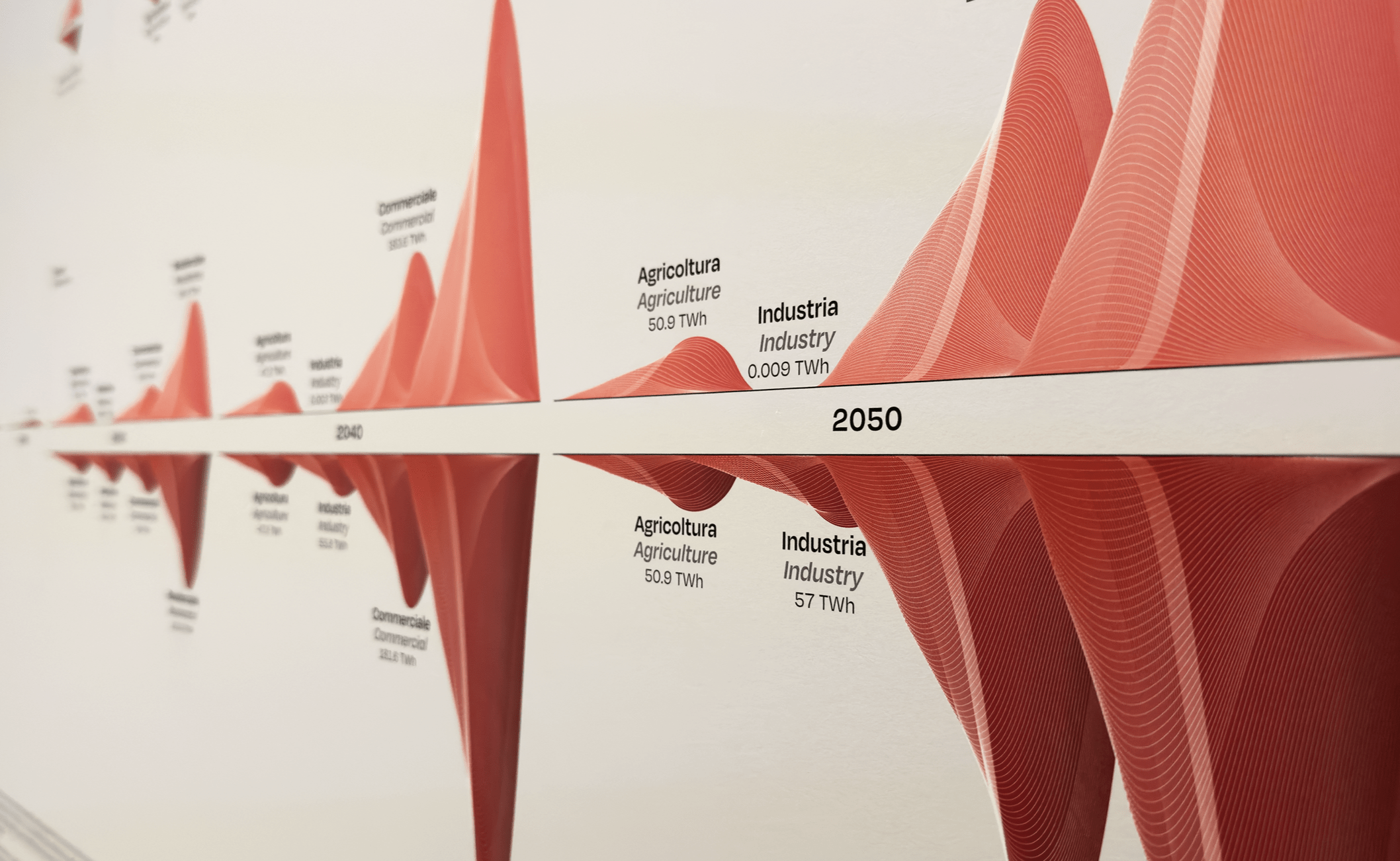
Infographics are highly versatile and can take on many different forms. They can be static, interactive, or even animated—allowing the format to be tailored to the specific message and desired impact.

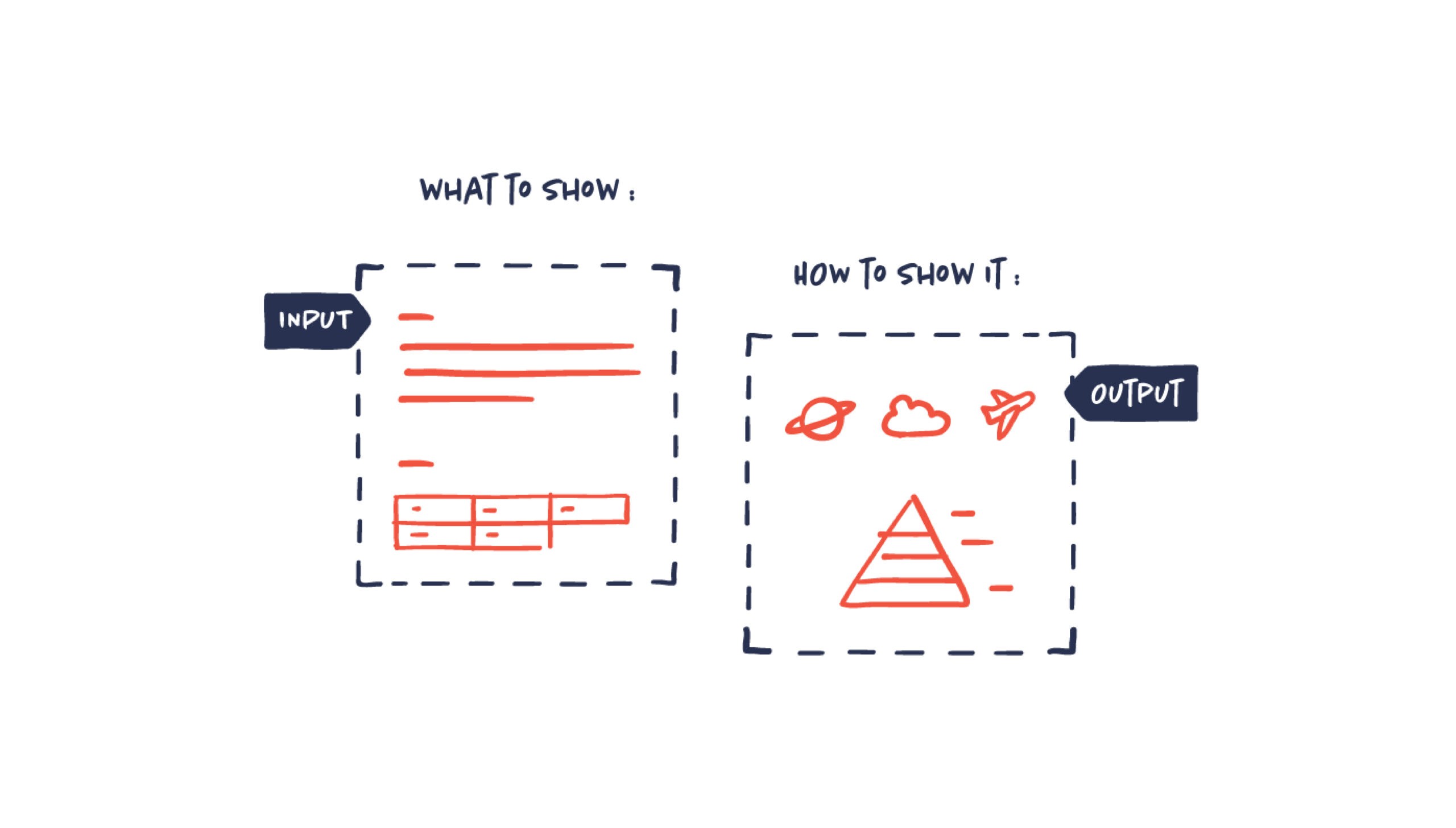
At its core, an infographic combines two elements: information and graphics. The information might come from research findings, facts, processes, large datasets, or something entirely different. It can include both qualitative and quantitative data. This information is transformed into a series of graphic elements, typically including data visualizations, icons, illustrations, layout, and text.
In other words, infographics combine the what and the how—almost any type of information can be presented visually, and almost any visual technique can be used to do it.
It’s tricky to pin down a single definition of an infographic. They pop up in all sorts of styles and formats, adapting to the content, the people they’re for, and where they’ll be seen. Unlike some things, infographics aren’t limited to one medium or a particular look:

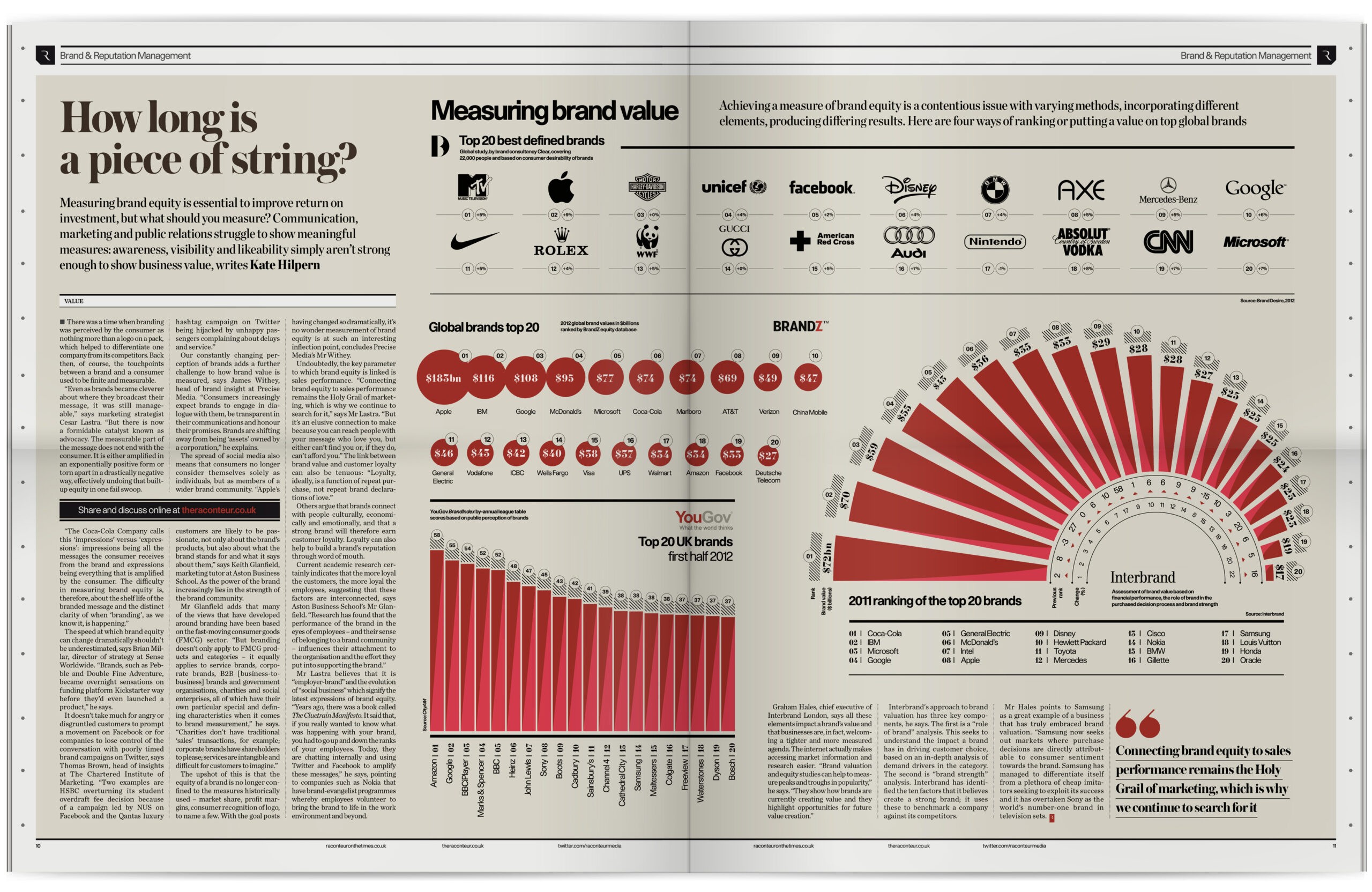
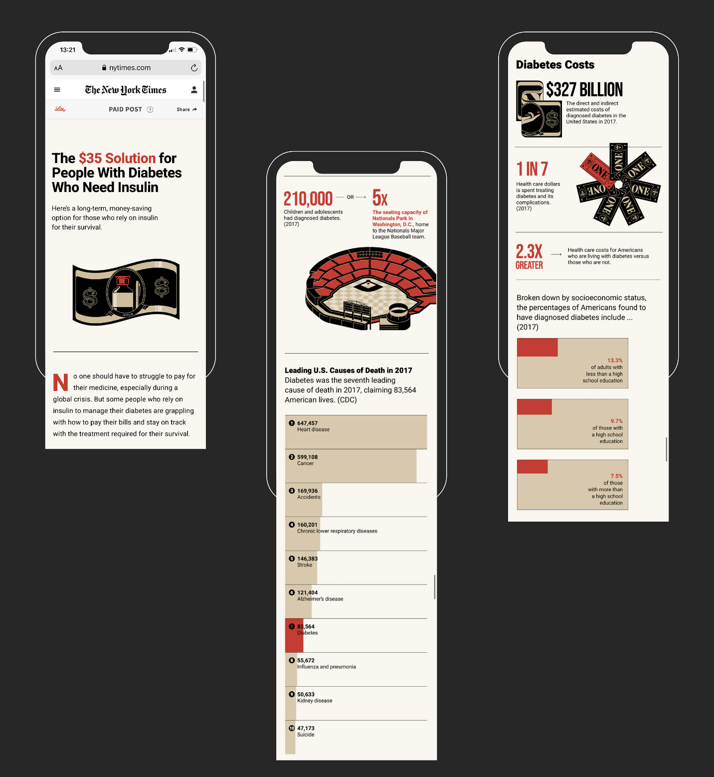
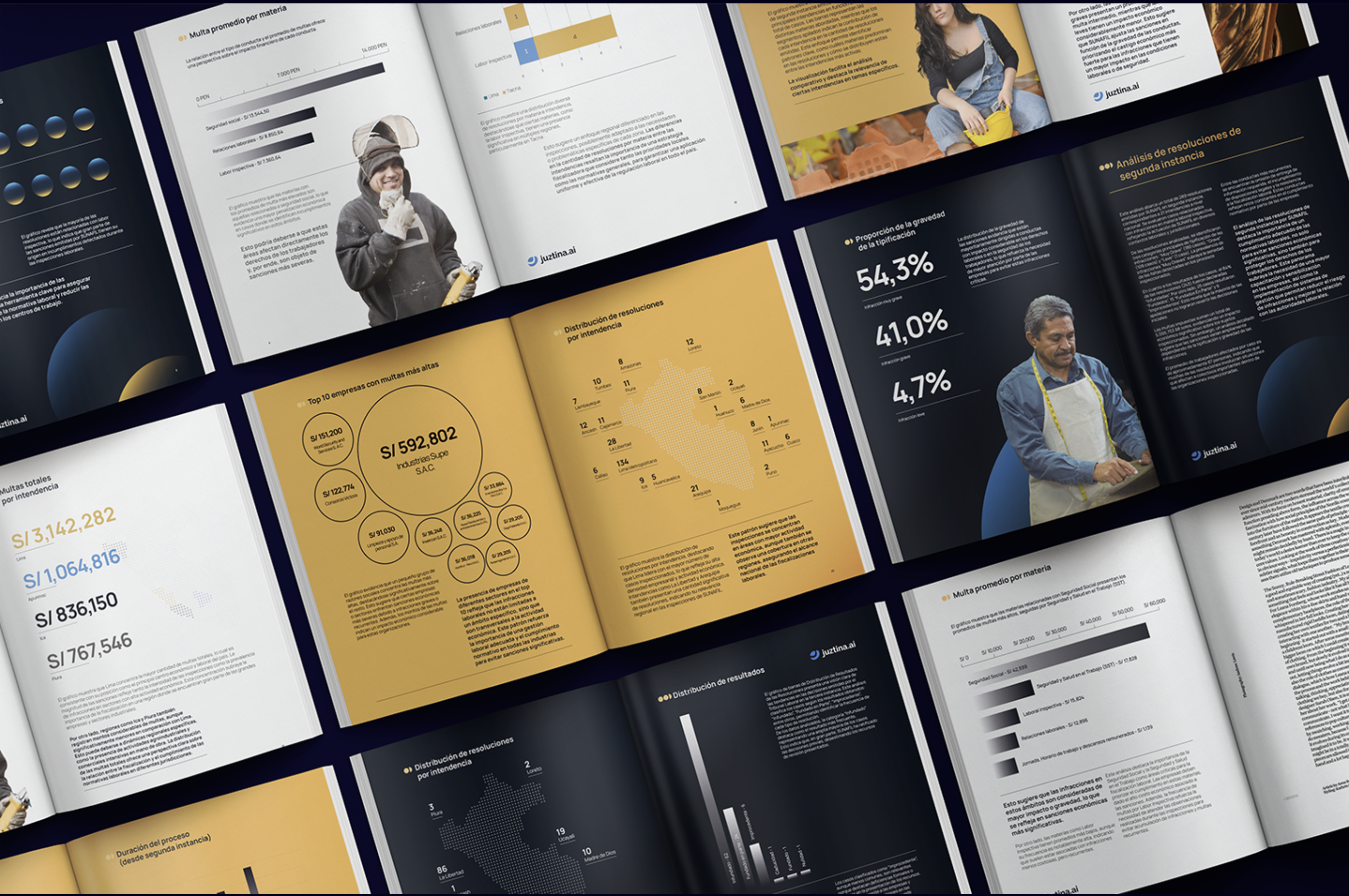
Infographics by Équiterre (SoMe posts) – Agency S/R (Newspaper publication) – NYT T Brand Studio (Website)
Why use infographics?
Infographics help make communication more visual, engaging, and clear. They’ve become increasingly important as a response to the growing volume of information and data that organizations need to communicate. In an age where attention is a scarce resource, infographics serve as a powerful tool for making complex content easier to understand.
There are many reasons why visual communication, such as infographics, is effective. But two key underlying factors are pushing communication in a more visual direction.
The first is the sheer growth of data. In fact, 90% of the world’s data has been generated in just the past two years – and this trend is only accelerating.
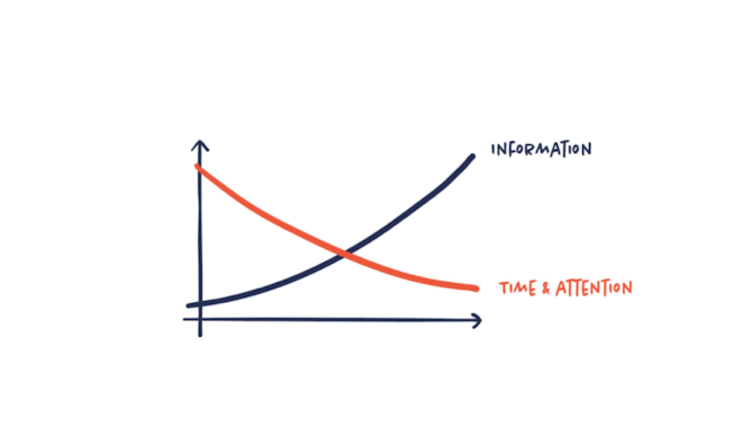
The second is the overwhelming amount of information we consume every day. On average, we’re bombarded with the equivalent of 100,000 words daily.
As the volume of information increases, our time, attention, and tolerance decrease. Infographics help cut through the noise by presenting content in a simpler, more inviting, and clearer way—making them a valuable solution to an increasingly complex communication landscape.
What is the purpose of infographics?
So, it should be established by now that infographics are a superior tool for communicating complex information quickly and clearly in a visually engaging way. However, the specific end goal of an infographic can vary significantly. The purpose can range from acquiring new customers and generating interest in a political cause to improving engagement or gain new sign-ups for your newsletter. To ensure the success of an infographic, it’s crucial to establish a clear end goal. This goal dictates every aspect: which data to use, which story to tell, how to tell it, the visual style, the chosen medium, and more. Without a defined goal, it’s impossible to determine whether the infographic has been successful. So always start with a goal. What should the infographic achieve?

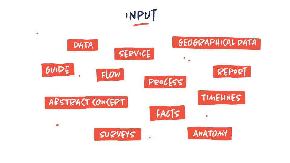
What kind of content can be used for an infographic?
The vague answer would be; any content that could be made clearer, more engaging, and more memorable through visual representation. And actually, almost any kind of content that involves data and information can be transformed into an infographic somehow. That doesn’t mean that all content should or would significantly benefit from being transformed into an infographic.
The type of content often involves
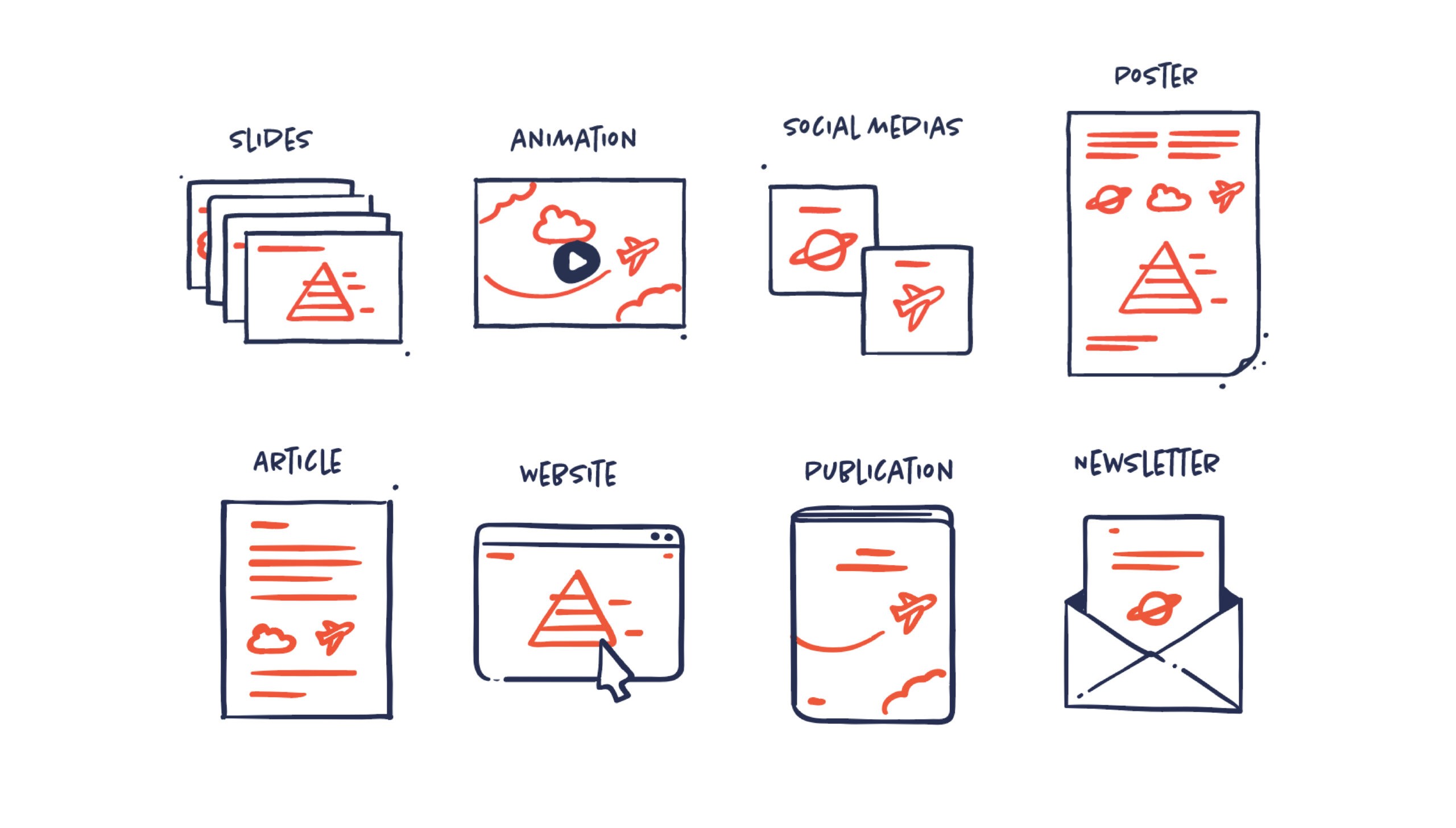
Where can infographics be used?
As mentioned, infographics aren’t limited to a single purpose, format, or type. They exist in many forms and should always be adapted to the context – including the content, audience, and media channel. Often, the same infographic is used across multiple platforms and media – but unfortunately, the format is not always optimized for each use. That’s why it’s important to consider the different formats and uses from the beginning when creating an infographic.
Need more infographic inspiration?
In the interest of creating better infographics, here’s a few links that might help you:
- Data Viz Project: Our very own project including the biggest archive of data visualisations. It guides in finding the right data viz type and includes thousands of great inspirational examples.
- Information Is Beautiful Awards: Biggest award show within the and a good place to get inspired.
- Ferdio’s Notebook: Our very own collection of best-practice working with infographics wether you’re a designer or a marketer.
And of course, if you need our help creating an infographic, please get in touch with us.