The Notebook
on Infographics
Hard-earned insights from our notebook
about infographics and information design.
Hands-on, honest and condensed.
Play, have fun
Information design is a serious communication discipline that requires both analytical, journalistic and statistic skillsets. But in the creative process, it is crucial to experiment and have fun in order to achieve remarkable and brilliant conceptual work. Genius ideas will only come if you truly manage to set creativity free. So go play, have fun.
Avoid information overload
So much to say, so little space? For fear of leaving out important information, you run the risk of cramping too much information into too little space.
But the risk is that the more you add, the more difficult it will be for your audience to digest and to remember your key message. Trust that your main story is good enough and be critical as soon as your infographic starts to overload. Don’t hide your key message in a haystack!

You are not looking close enough
In information design, the devil is in the detail. Small inaccuracies might make your designs completely misleading and impossible to decode. Have a closer look at your work. Your icons might be inaccurate, the scale of the graph misleading or the text might not match the visual. All details matter when you want to communicate clearly, effectively and convincingly. So have a closer look, be critical, adjust and refine.

Nothing is for everyone
All communication has a target group, a specific audience. When working with information design, knowledge about your audience should inform the decisions you make regarding style, tone of voice, etc. Avoid trying to communicate to everyone – that’s impossible. The better you know your target audience, the better you will be able to communicate.

Use and exploit your basic visual toolbox
Data visualization is all about converting data into meaningful and effective visual representations. In order to do so, you need to become familiar with your toolbox of visual assets like size, color, direction, etc. Don’t use all at once but choose and experiment to find the most effective for the task.

Avoid chartjunk
Chartjunk refers to visual elements in charts that are redundant in conveying information or even distracting to the viewer, making the chart more difficult to understand.
There is a fine line between when visual elements are helpful and beneficial and when they turn into chartjunk. Visual elements should always support the story and communication rather than disturb the message.
Show what you say. Say what you show.
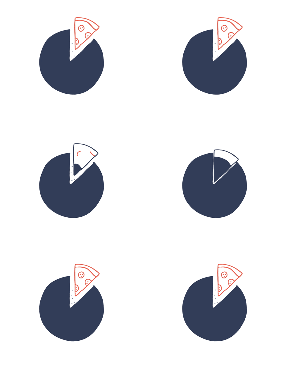
In information design, text and visuals are intertwined. The message should support the visual. The visual should support the message. This advice seems basic, but infographics often seem to fail in this regard. So ask yourself: Are your visuals and copy in sync and complementing each other?
Think less. Sketch more.
The fastest way to test your idea is to sketch it. Test and qualify your ideas by visualizing them in rough sketches. Without a concrete idea on paper, it is often impossible to qualify the idea or make any decisions about it. Stop overthinking and think while you sketch.

Leave out superfluous information
Data visualizations are often more complex than they need to be: A way to detailed axis, fine meshed grid lines that are unnecessary or additional technical details that just blur the core message. The more superfluous information you include, the harder it is to decode the information and the key message. Leave out all superfluous information and include only the information necessary or helpful for comprehension.

Use common data visualizations for common understanding
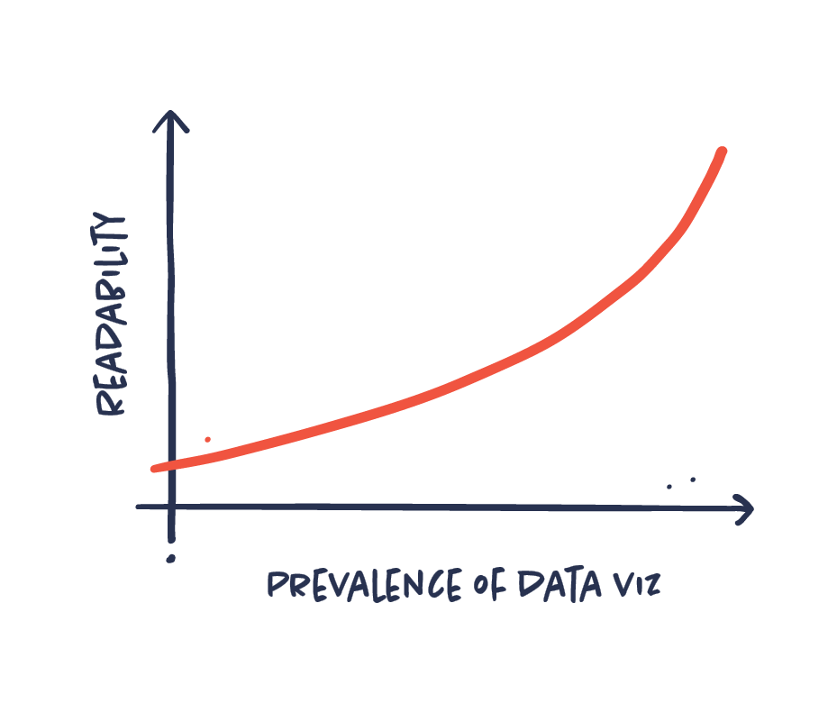
Information designers sometimes tend to favor more exotic and artistic data viz types. Though this can be inspiring and useful, it is important to be aware of the readability and function of the chart types. Basic data visualizations like a bar chart or a line graph work because everyone knows how to read them. Choose the data viz type that conveys the message the best and the one that your audience will understand.
Virality can’t be planned
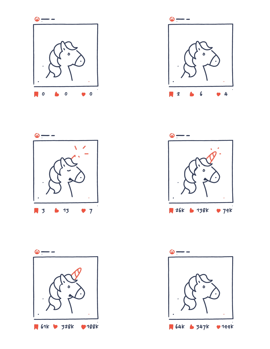
You can’t design a ‘viral video’ . Your video might go viral, but it’s almost impossible to plan. You might be able to produce content that is more likely to go viral or plan a strategy that makes it more likely. But it is naive to think that we are in control of virality. Stop focusing on virality and start making great and inspiring content that matters.
Your infographic is too text-heavy
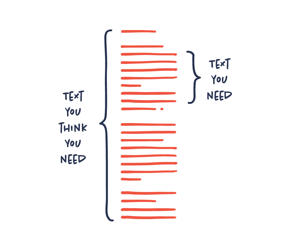
Nobody wants to read an infographic that is text-heavy. It kind of ruins the whole point of having an infographic in the first place.
Aim to use as little text as possible. In most cases, the less text you need to communicate your message the better. If you feel like you need a lot of text to get your message across, it may in fact point to a problem with your infographic.
Some things are more important than others – Prioritize your content
The first thing to do with all your content is to get an overview. What is very important and what is less important? This basic prioritization is essential when scripting, sketching and designing. It sounds easy, but prioritizing is usually harder than it sounds. Making these choices requires a deep understanding of your content and the story you are trying to tell.

Solve. Improve. Perfect.
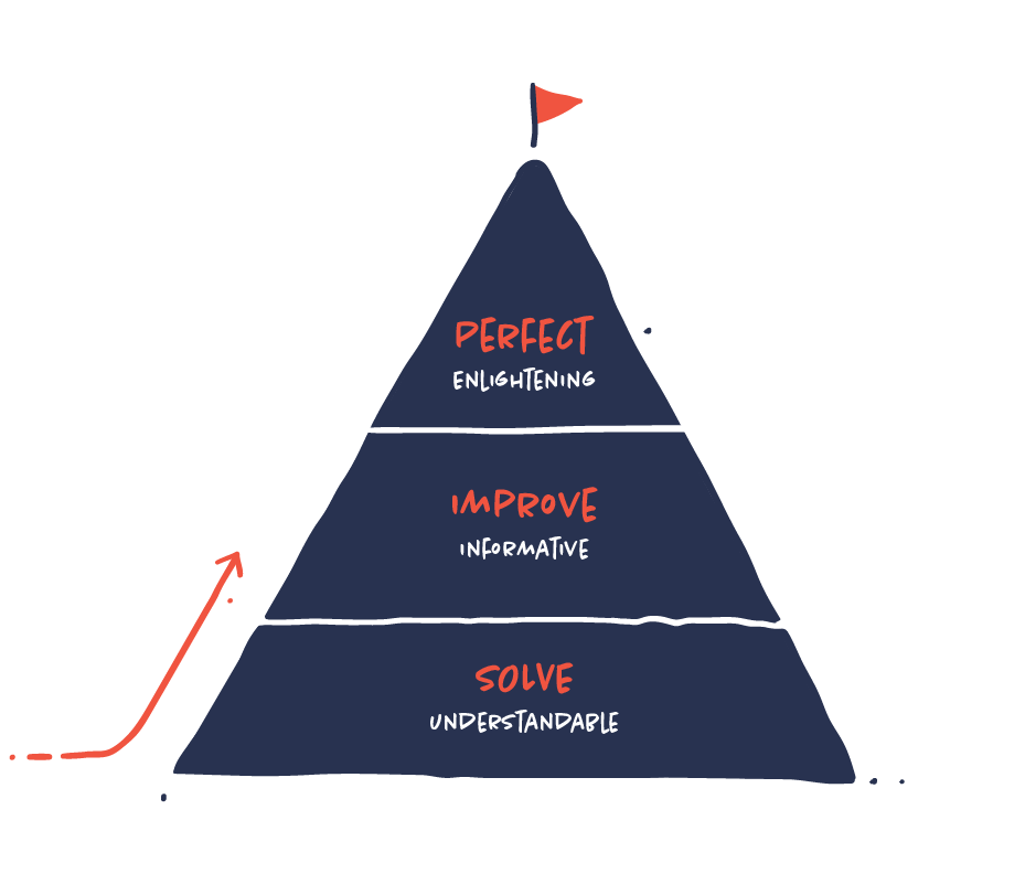
When working with information design, the first thing you want to do is to solve your communication challenge by making your infographic understandable. That’s the foundation. Then you must make improvements to get your message across more clearly. After that, you can start to perfect your work. In other words: There are no shortcuts to perfection. Strive for the top, but always start at the bottom by solving your communication challenge.
Chop your visuals into digestible pieces
Design your content and visuals as flexible as possible to create multiple visual stories from one core piece of content. One coherent piece of content, animation or complex infographic may consist of multiple visual stories that can often easily be chopped into small individual stories without losing its meaning. This way you will gain more from your content and you will be able to distribute your content more effectively to different channels.

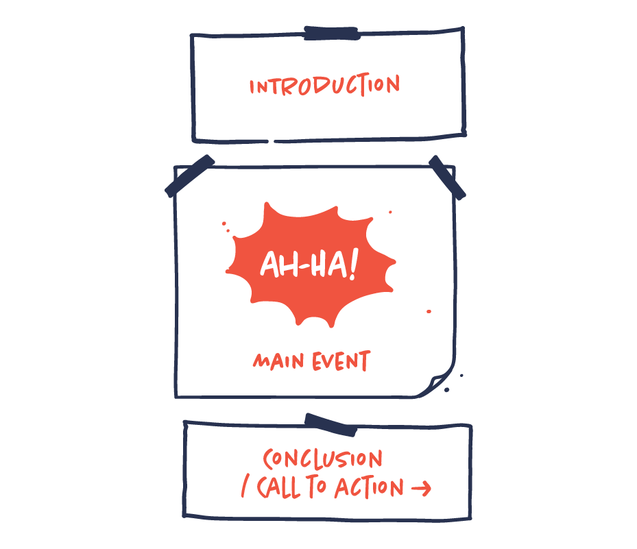
Use a three-part structure
Following a three-part structure is an effective way of structuring your infographics. It consists of an intro, a main event and a conclusion or call to action. The intro should contain all the basic information you need to establish to be able to comprehend the main event. The main event is the key message and the heart of the infographics. The main event should often be followed by a conclusion or a call to action that supports/underpins the infographic.
Collect, sort, analyze, visualize
These are the most important steps in data visualization (in most cases):
-
Collect the data. Which data is relevant?
-
Sort the data. How is the data connected?
-
Analyze the data. Are there any significant patterns?
What is the story? -
Visualize the data.
How do we visualize the story most effectively?

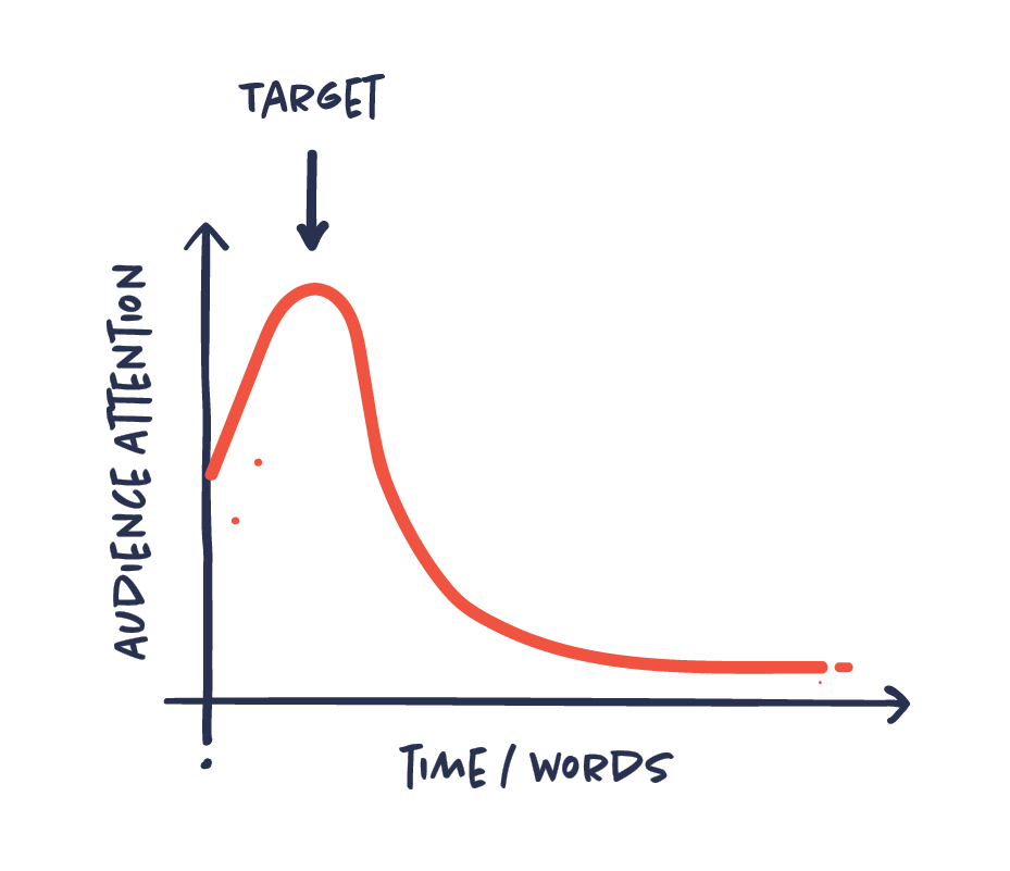
Design for short attention span
It’s becoming increasingly difficult to engage and hold the attention of our audiences. More content and more publishers than ever before competing to reach the same audience are some of the reasons.
That’s why you have to design with this challenge in mind. Aim to get the attention from first sight by presenting something interesting from the start. Captivate your audience to increase the chances that they will engage with your content.
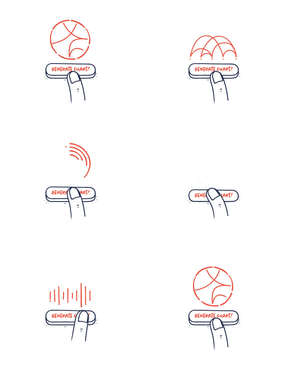
Your tools should not decide what your visual should look like
In recent years, we have been flooded with amazing new data visualization tools. It is easier than ever before to exploit these tools. They are often used to make advanced and heavy data viz that would have been almost impossible to make before. But just because it is possible, doesn’t mean that it’s a good idea. The story you want to tell should decide how you visualize your data not your tools. The visualization should underline your story and not be more complex than necessary to communicate the message.
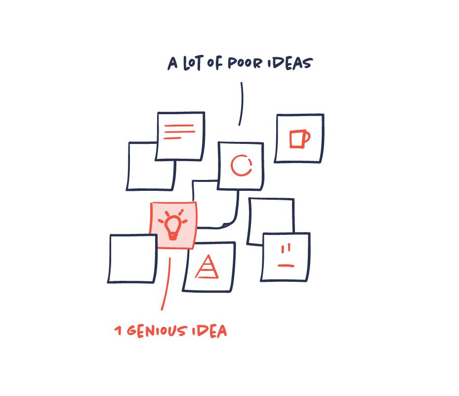
Create more bad ideas to get that great idea
The vast majority of your ideas are deficient, vague or just plain poor. That’s ok. But the persistent process of producing more ideas will inevitably get you to that genius idea you were not able to come up with at first. Getting past the poor ideas is just hard work. That’s the law of the creative process.
Follow the rules, bend the rules
You need to know and master the basic rules and best practice for data visualization. But there are always exceptions to the rules. There will often be cases or circumstances where you need to bend the rules – or even ignore them —to achieve the best results. The art is to know when to follow the rules and when to bend them. Start by the following the rules and only bend them when it is necessary to communicate your message better and more effectively.
Avoid clichés
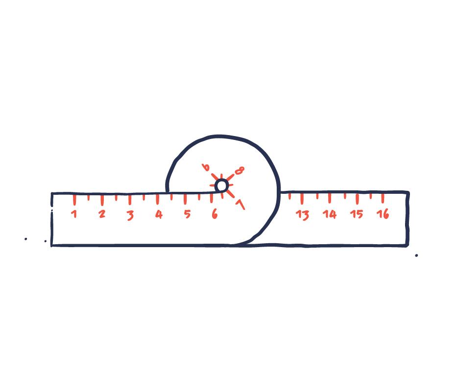
Visuals should not be generic and vague but clear and exact. Clichés are often fluffy and defocused and not concise enough and should therefore be avoided, if possible. Visual clichés are usually the result of lazy design rather than best practice. Try to challenge the most common and prosaic ideas and choose visual representations that are both distinctive and accurate.

Skip the lorem ipsum
Lorem ipsum doler sit amit… It’s lazy, it’s misleading and it’s not really possible to make good design decisions based on generic lorem ipsum. Use real copy instead. Even temporary messy titles and text are better than using lorem ipsum. In information design, design and writing are intertwined, so write as you design. Work with both text and visuals simultaneously for better and more unified results.
It’s time to kill your infographic!
Infographics can’t solve everything and are far from always the best solution for communicating information. During the process of making an infographic, your initial idea about how your infographic would solve your communication task might come to a dead end. The visual representation might overcomplicate the message, it is too abstract and vague, or it doesn’t fit the format. Acknowledge when infographics are not working and it is time to kill your infographic.

Double-check your data
Data is fragile to human imperfection and you need to be cautious and thorough with your data and data visualization. This goes without saying, but nevertheless, it is relevant advice to most of us. It is easier to check than to fix or change later once the data has been published. Double-check your data and sources and make sure that your visualizations and numbers are in sync.
Tell one single coherent story
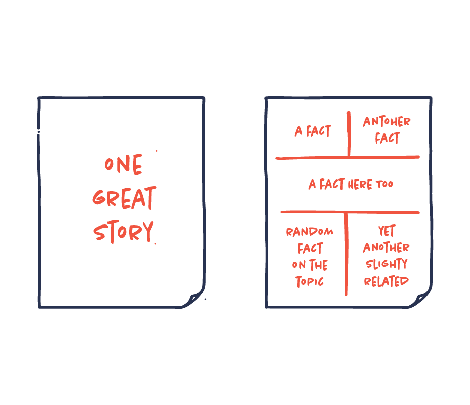
You have so much data and so much to say. It is tempting to try to fit it all in. However, it will easily turn into a collection of unrelated random facts. That is not how you tell a good story. Resist the temptation and tell one single, focused story. Choose quality over quantity. One well-structured coherent story will be more memorable, more interesting and much more powerful.
Watch out for the cobra effect
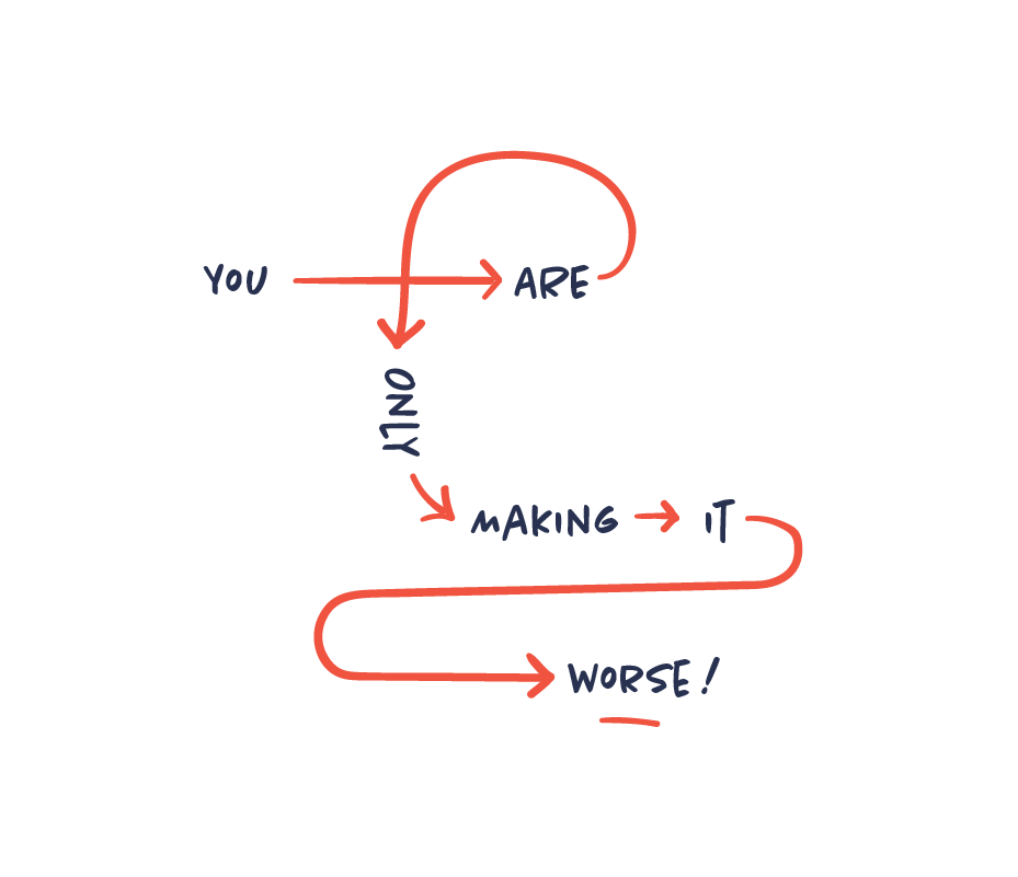
The cobra effect occurs when an attempt to solve a problem makes the problem worse as an unintended consequence. When solving a communication problem, this can easily happen when you try to simplify complex information. The information that was initially difficult to understand is now utterly incomprehensible. This means that you need to start over or even kill your infographic.
Cut the crap
Crap is the unnecessary information and visual assets we start to add unconsciously because we think it is needed or because we are scared of simplicity. You fail to notice that your visual content is beginning to include a lot of superfluous crap. Don’t be afraid of simplicity or white space. Just cut the crap and get rid of everything that does not seem to help the main purpose of the infographic.

Above all, be trustworthy
Your audience must rely on your information and trust that it is credible.Trustworthiness and authority should be present in your sources, your data, your visualizations and your design. Treat your data and sources with respect. Don’t be cocky, frivolous or too simplistic, as it will make your data visualization lose authority and trustworthiness.

Time matters
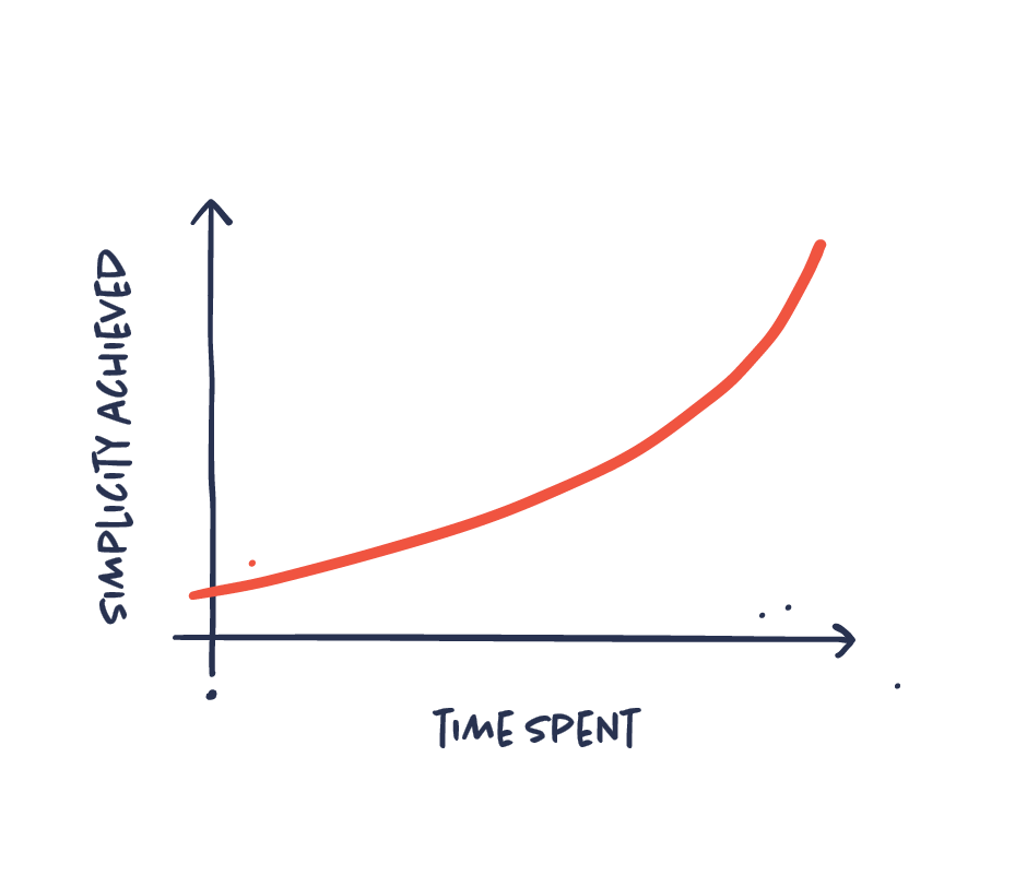
Making good information design is time consuming. That is because it is complex and involves many different disciplines. There is no short cut to a good result. Accept this as a premise. The more time you spend, the better will the result be. There will always be room for improvement and perfecting.

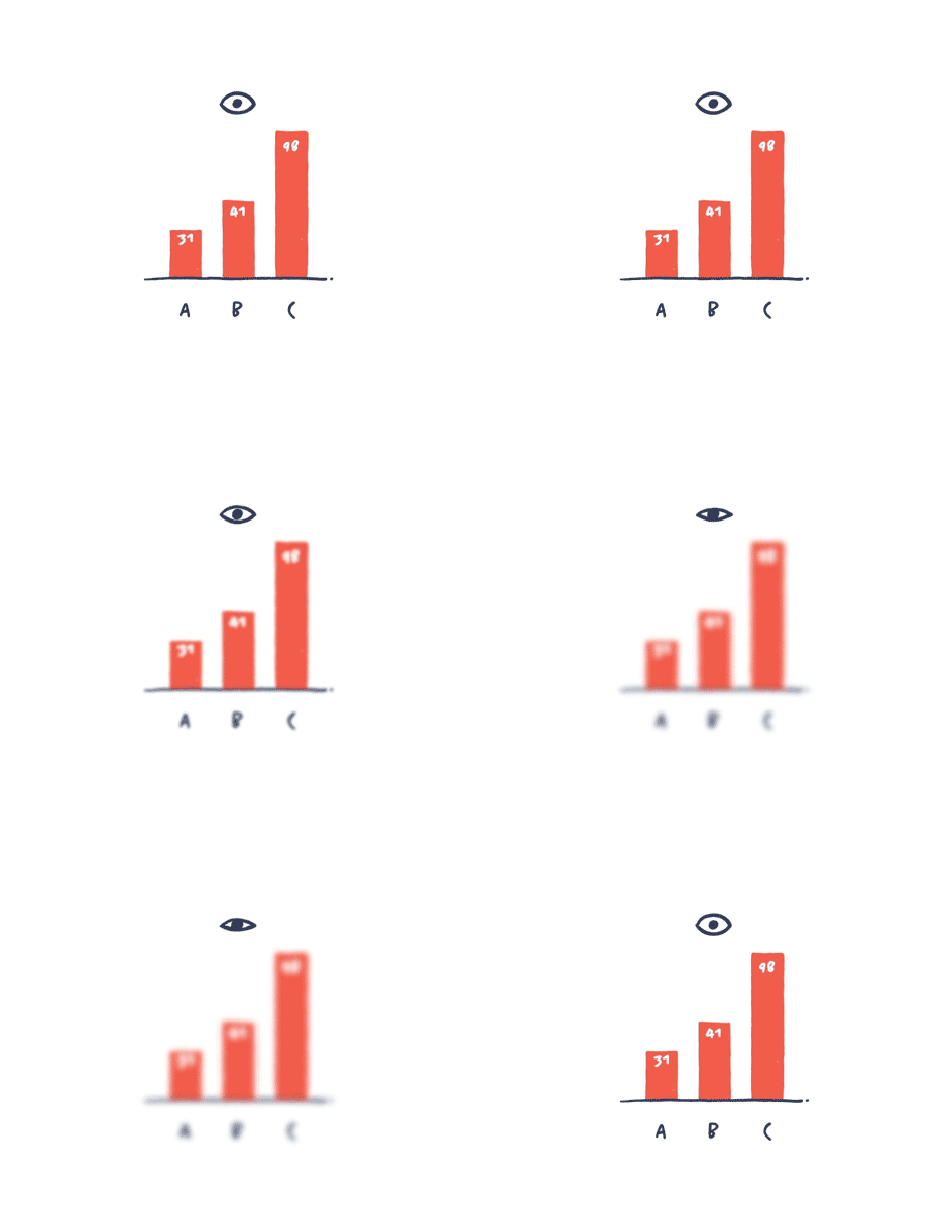
Do the squint test
We often get lost in our own work, lost in details, unable to see if our design actually works as intended. The squint test is a quick way to check the effectiveness of your visuals. Look at your infographic, squint your eyes until all of the text is blurred. Do you still get the purpose? What attracts your attention? Does the overall composition make sense? Is the hierarchy right? Could something be left out?
Balance appeal and clarity
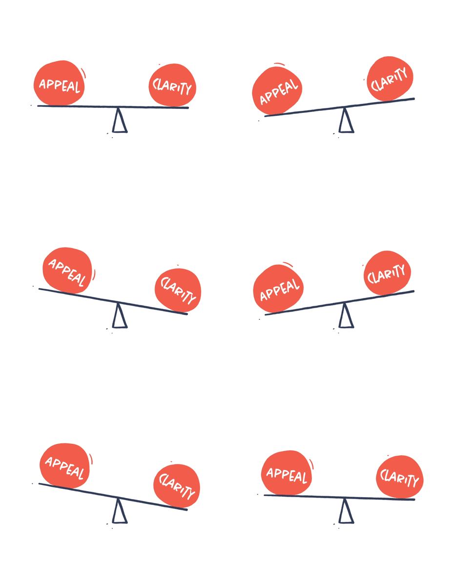
Your visuals should be concise and easy to understand. You also want your visuals to be appealing, interesting and able to evoke emotions. Appeal and clarity are not contradictive. But sometimes more clarity can lead to less appeal and vice versa. It is your job to balance the two in order to make truly appealing and concise visual communication.
Well briefed is half done
What is the purpose? Who is it for? Why is it important? How should it feel? Where will it be published?All of these questions are essential for any piece of information. The brief is what we will base all of our design decisions on, yet it is often underprioritized or inadequate. It is only when we are able to describe and frame the project that we are able to start making great visual communication.

Less is more work
To make the complex simple is no simple task. Simple, minimalist and clear communication might look easy, but behind it there is probably hours or days of hard work. Accept that simplicity is difficult and time consuming. The more time you invest, the more simplicity you will be able to achieve.
Consider cultural norms
Visual communication is not a universal language. Cultural differences in interpretation are more prevalent than you would think. What symbolizes freedom in Europe or how a family home is illustrated might not be the same in Asia. We need to pay careful attention to all of these subtle differences in different cultures and different target audiences.

Templates are infographic junk food
Infographic templates might be tempting. They are fast, easy and cheap. But truth is that they will rarely solve your communication challenge. Templates are generic both in input and in output. They are too rigid, limiting and will often dictate what and how you communicate. Our advice is: stay away from templates.
Check readability!
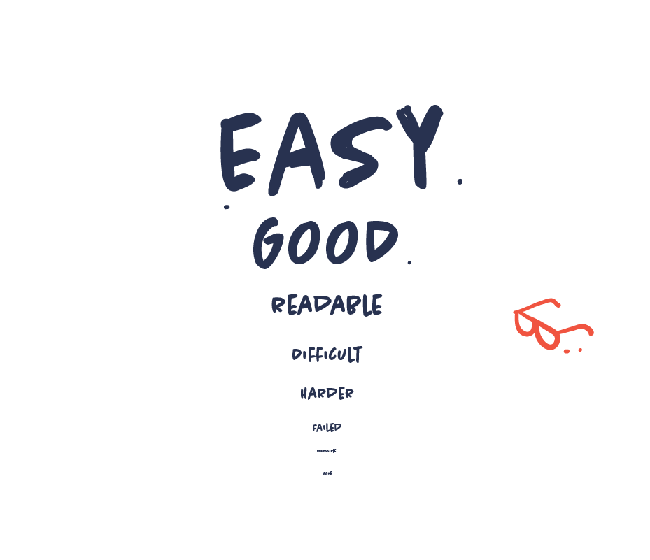
It should be obvious. But readability is a major concern in information design. And we often fail at this because we have not considered the context or the format or we fail because we value aesthetics over function. Perhaps the font size is not big enough or the contrast is too vague. So make sure that the text is not just readable but also pleasant to read in any given context. Whether it is on a mobile phone or in a social media feed and remember to test it.
Users are different – as should your content be
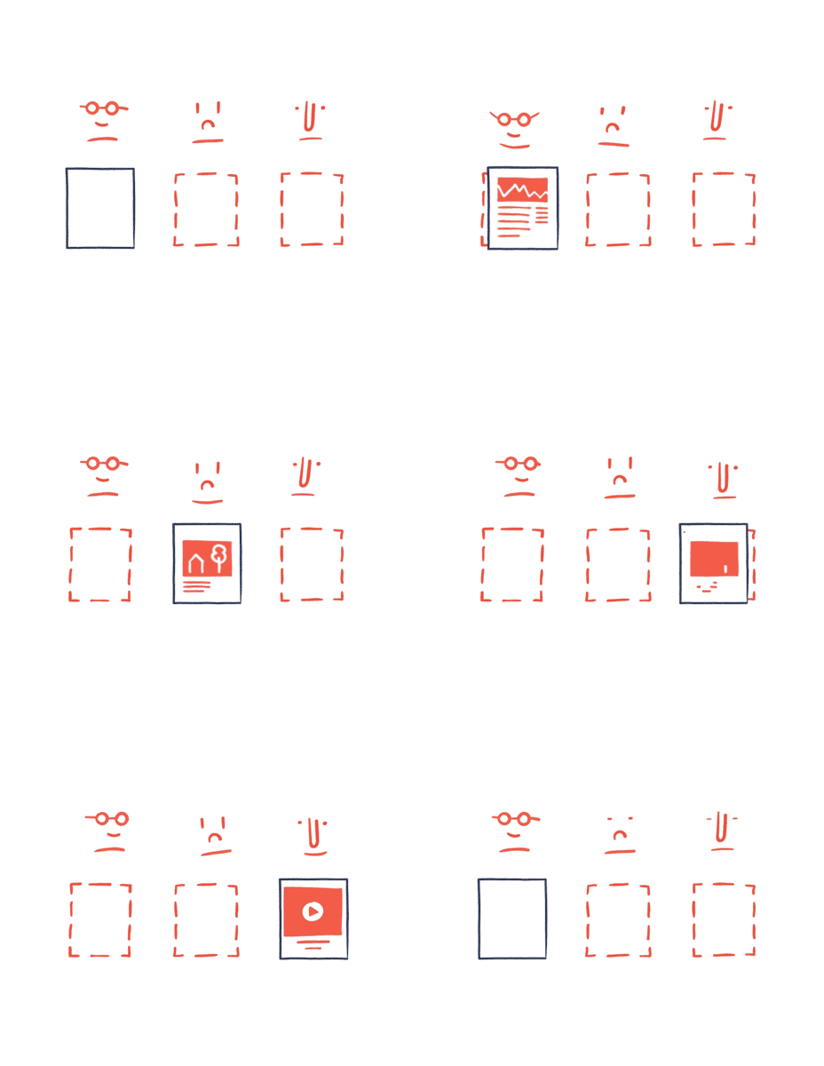
Different audiences have different backgrounds, knowledge, needs and preferences. Ideally, your content should be tailored differently for different audiences. Consider things like cultural background, attention span and interests. So when possible, adjust or even remake your content to target your audience better.
Story is king
You can’t turn a poor story into a great infographic. No matter how much you’re trying to add cool, magical and brilliant design, it’ll still be a poor story wearing fancy cosmetics. Design simply can’t rescue failed content.

Make your infographic stand out visually
Your content has to compete with thousands of other pieces of content online. So your content will easily fail if it’s anonymous or generic. That’s why your content needs to stand out visually and be remarkable. You want your visuals to make an impression and be remembered in order make an impact.

Data is imperfect
Let’s just stop thinking data is perfect. Data is primarily human-made. “Data-driven” doesn’t mean “unmistakably true,” and it never did. That’s why working with data and communication data requires an even greater sense of responsibility. Treat data with respect and remember that it’s not perfect.
Dig deep to identify the essence
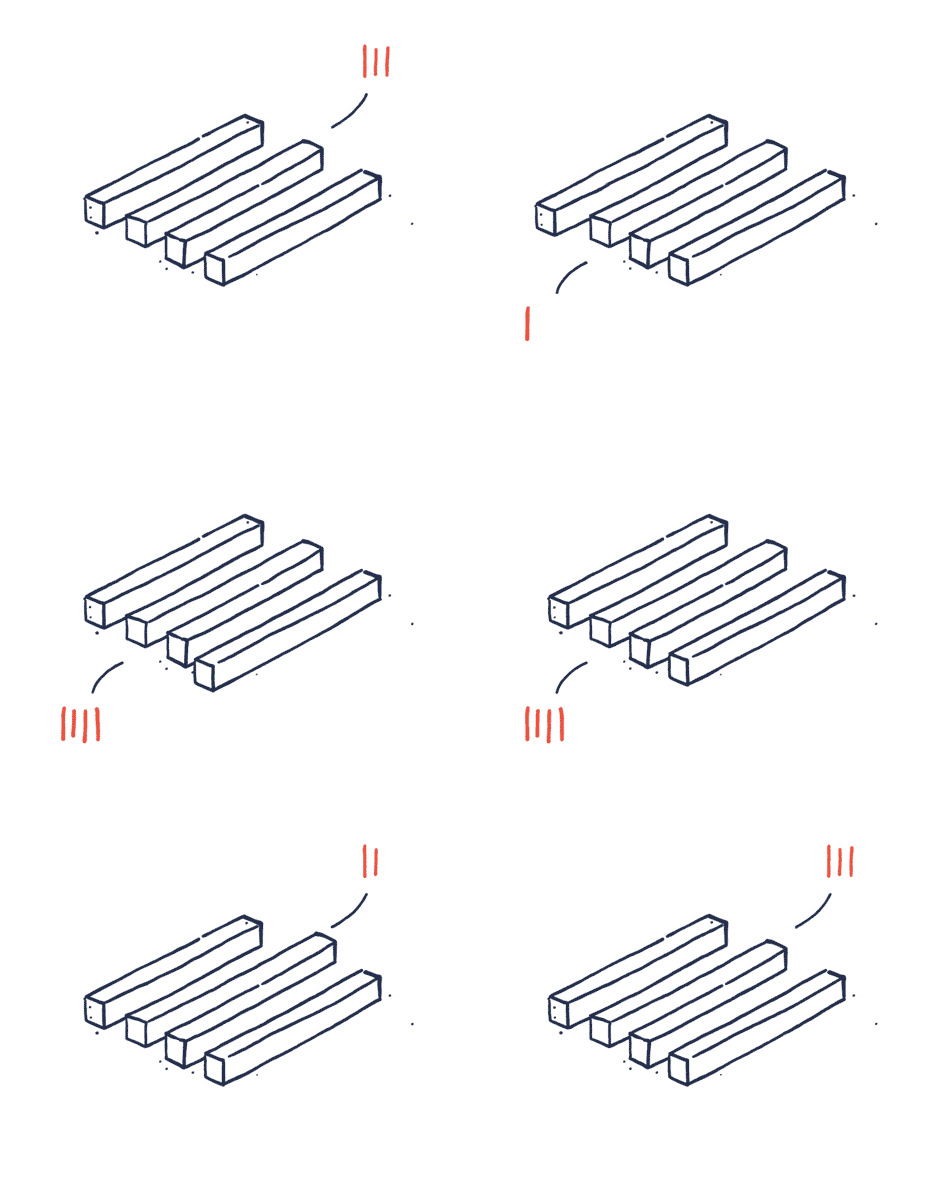
The pile of information on your subject may be extensive and you need to dig a lot before actually finding what you’re looking for. This dirty work includes everything from arranging and researching to identifying and prioritizing the information. All this work can be time-consuming, but necessary in order to extract just the information you need for making concise and powerful information design.

Design hierarchy
Some information is more important than other information. First you need to prioritize your content, and secondly you need to implement this hierarchy into your design. Design what should stand out and what the viewer should pay most attention to. Use order, size, composition, styling etc. to achieve the right hierarchy.

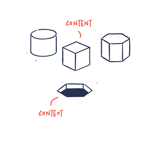
The context defines the shape of your content
Your content won’t work in just any given context. The context is the channel, the media, the audience, the time and the place. The context will determine how you should approach and build your visuals. If the context is already fixed, you need to build content that’s suitable for the given context and tailored to it.
Test early and test often
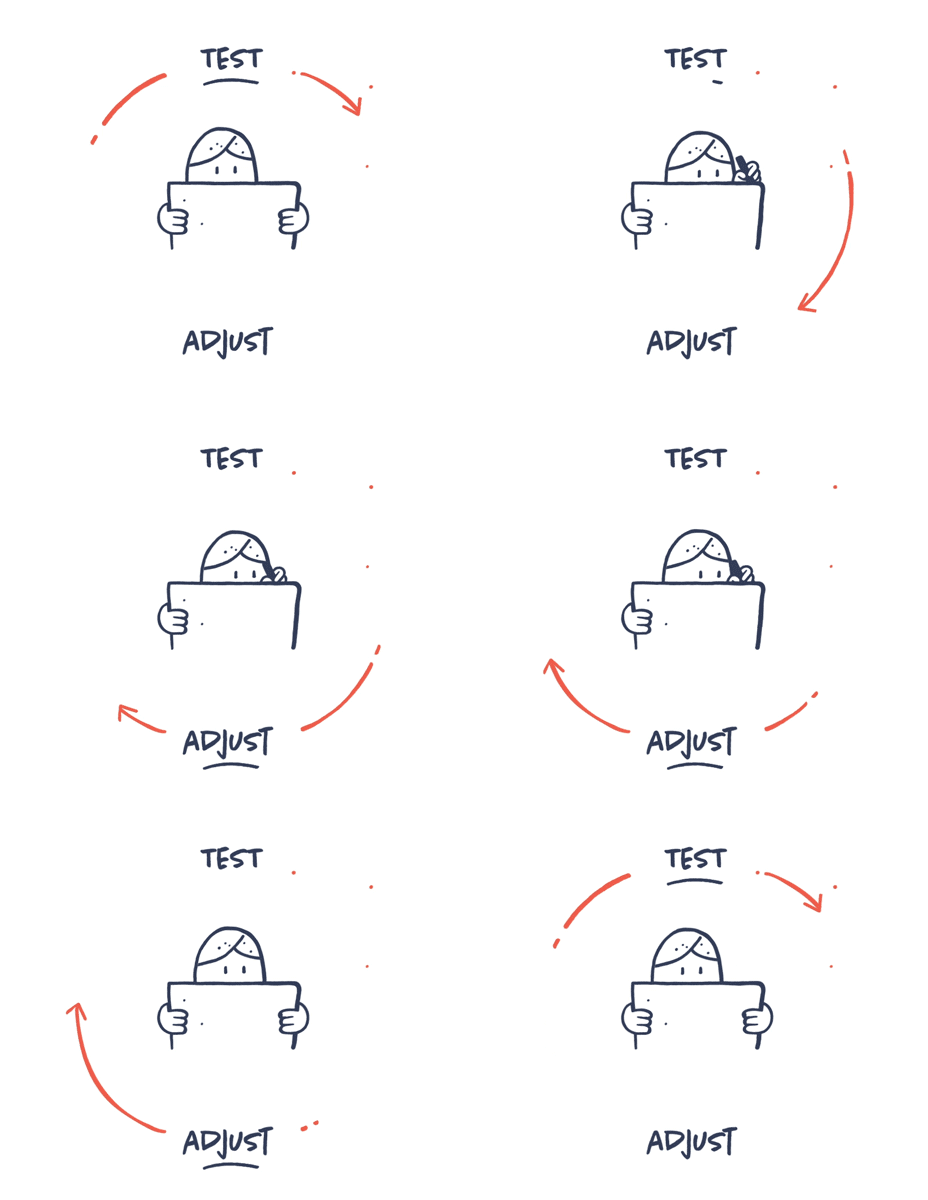
Testing your visuals is crucial when it comes to ensuring that your message comes across and is understood correctly. You may get it, but the only way you can be sure others do, is by testing.
Get feedback from independent, unbiased users. If people don’t get it, it is probably too complicated or unfocused, or it is failing for other reasons. Get feedback and learn how your information is perceived and understood. Iterate and adjust accordingly or even start all over if necessary.
Balance the rational with the emotional
Though information design may be based on cold numbers and facts, it shouldn’t be dry. In fact, it needs to evoke emotions in order to resonate with an audience.
The best information design strikes a balance between the rational information that needs to be conveyed and the emotional attachment an audience has to the visual depiction.

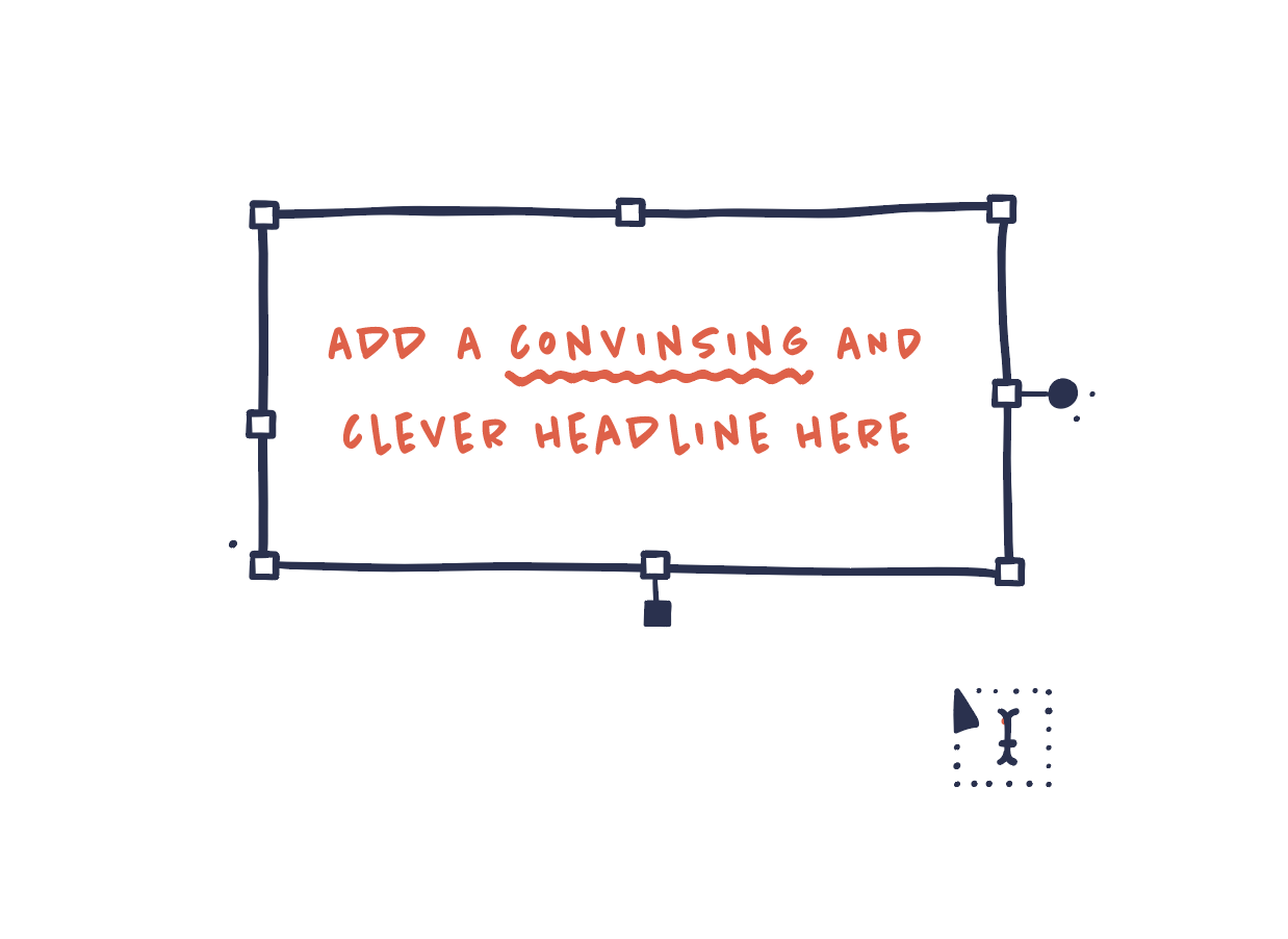
Hire a copywriter – or become one
In information design, good copywriting can’t be overestimated. Good copywriting is just as important to information design as the actual design. Copy should be sharp, catchy, inspiring, convincing and persuasive. Ideally you should include a copywriter in your team, or at least incorporate the skill set of a copywriter into the process.
Simple ≠ simplistic
We aim to make complex information simple and easy to understand. That’s simplicity: when you can identify what’s essential and eliminate the rest. Simplistic on the other hand is when you treat complex issues as if they were much simpler than they are. There’s a clear distinction. Complexity is never eliminated but can only be reduced or concealed. Or in the words of Albert Einstein:
“Everything should be as simple as possible, but not simpler”.

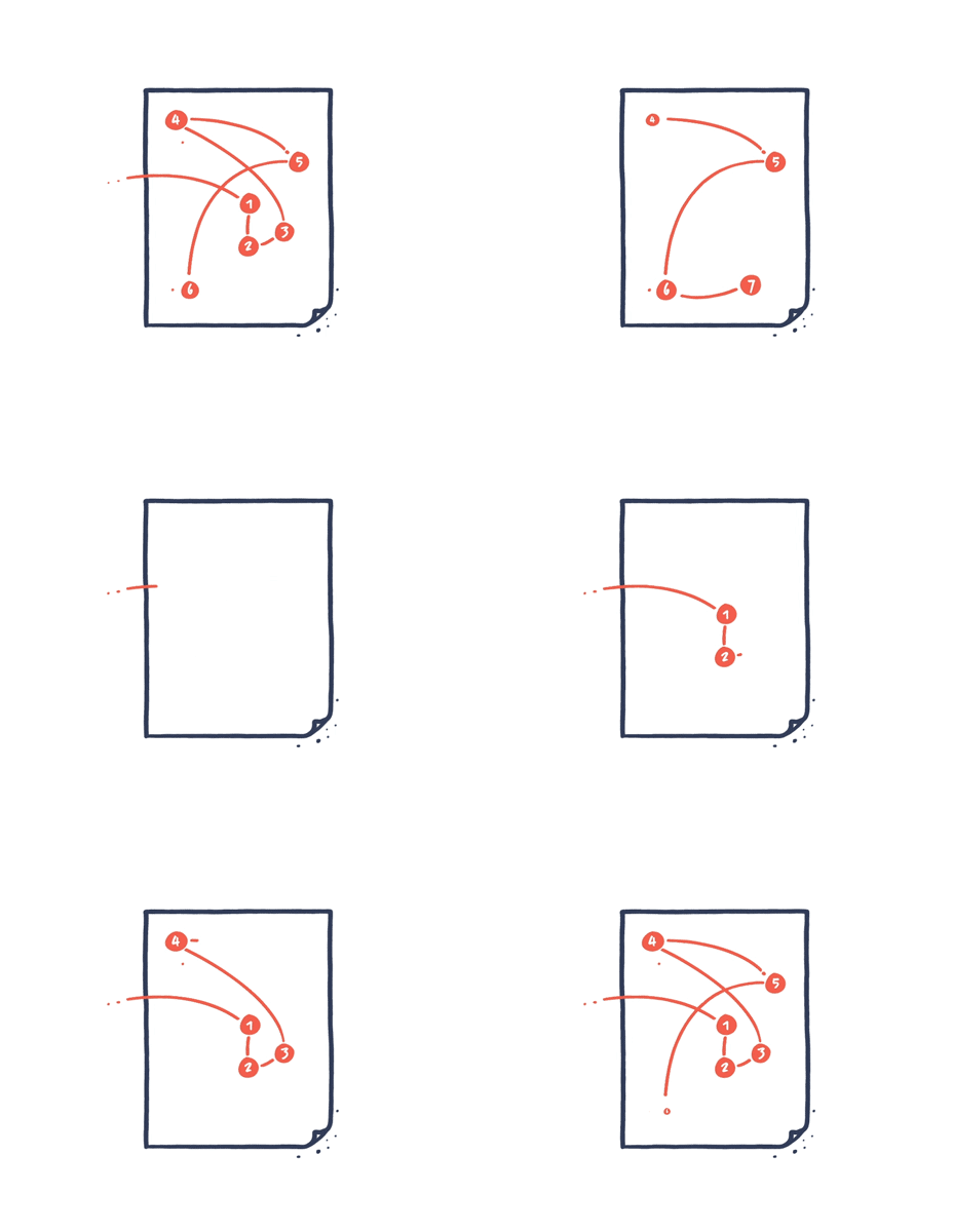
Visual content has no fixed reading order
When you interact with text, you mainly read it in the same order from upper left to down right. With visual content, there’s no predetermined order – you simply go wherever your eyes take you, and you spend more time on some parts than on others.
Design a flow that helps your audience navigate efficiently. The end goal isn’t to force chronology, but to support the reading experience in a meaningful way.
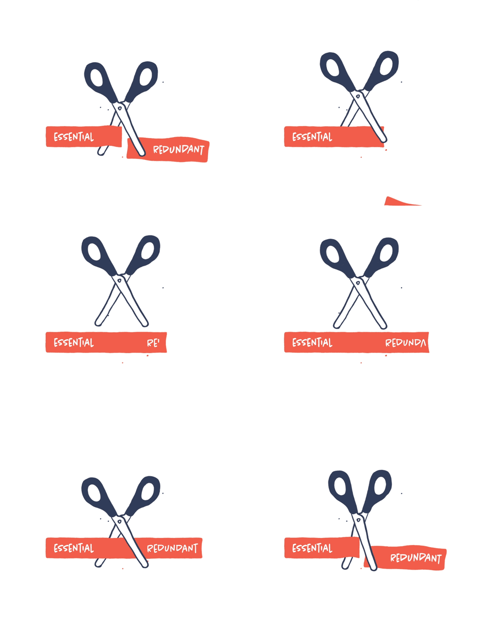
Trim, trim, trim
The constant struggle for any project in information design is to trim your content, so we’re left with only the essential information, and everything redundant is left out. Keep asking: Is it essential to the story? If not, leave it out. A perfectly trimmed story will be sharper and more powerful.
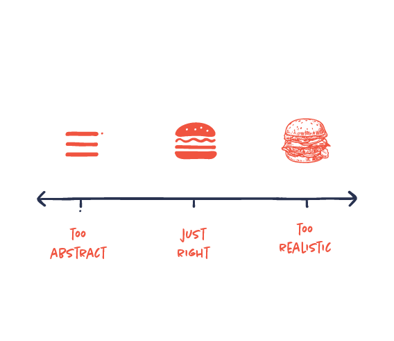
Not too abstract, not too realistic, just right
An illustration can easily be too complex or realistic for communicating a message concisely. On the other hand, it can also be too simple and abstract to understand. Cristoph Niemann introduced The Abstract-O-Meter as a scale to demonstrate how illustrations need to have this perfect balance, in which there’s just the right amount of information to be perceived effectively.
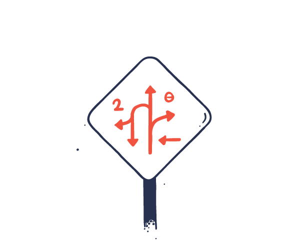
Tell the story differently for different media
Often your story will be used for different media. The story should be communicated differently to fit both the possibilities and the limitations of the media. There’s simply no such thing as one-fits-all. Therefore trim, add, edit, divide, adjust or redesign for the best results.

Always Ask: “Is there a clearer way to do it?”
Be extremely ambitious about your visual communication. Always try other solutions and challenge your initial idea. There’s never just one way. And the aim is always to find the best, clearest visual explanation.
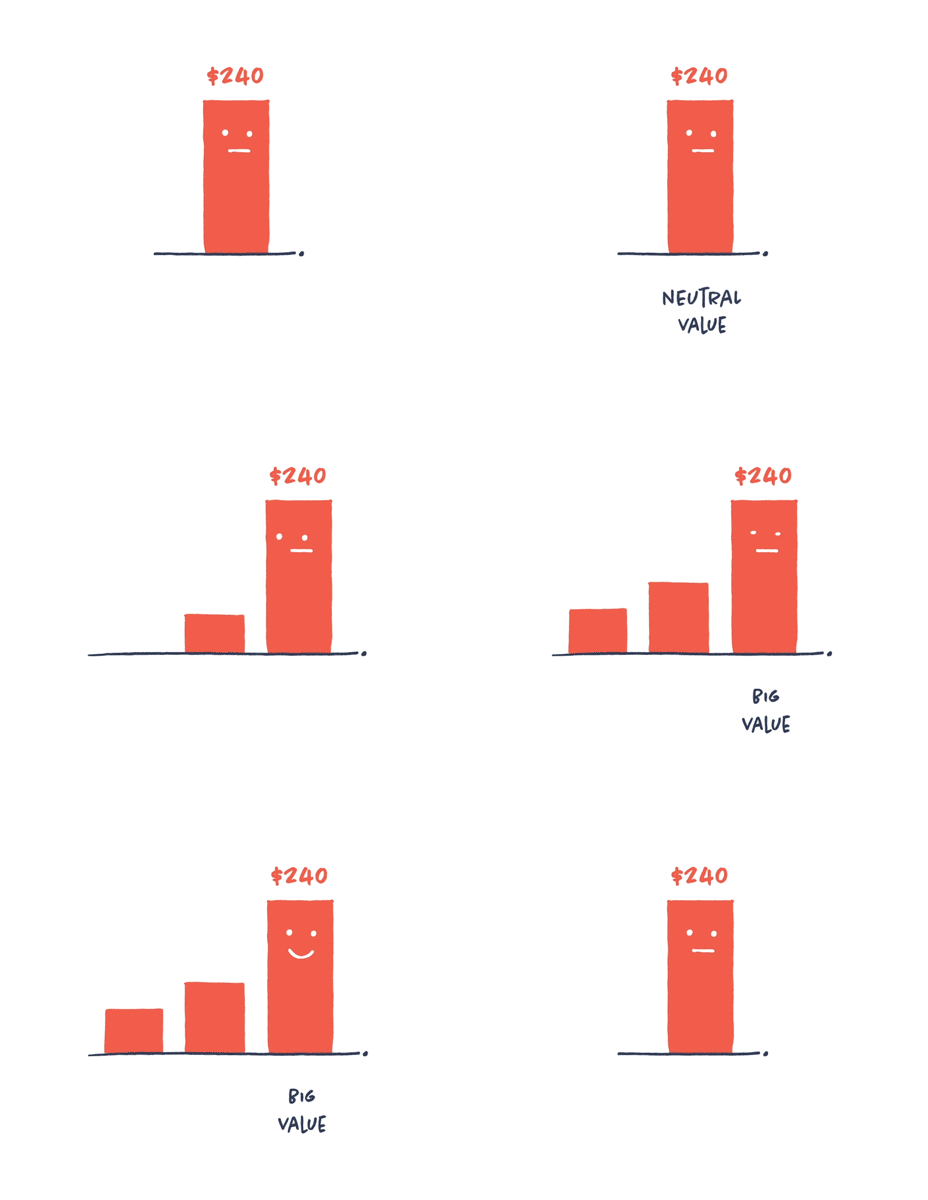
Put numbers in context. Always.
Data without context leaves the reader wondering. Is it a high number? Is it low? Good? Bad? The context will tell your audience whether the sales figures shown should be perceived in a positive or negative light. Everything’s relative, so we always need some kind of context in order to understand a number.
Love your spreadsheets
Don’t be afraid of the spreadsheet. It can be just as much of a playground as your Adobe Suite. This is where you find patterns, organize your content and discover great stories. You might not be a data analyst, but data curiosity and an analytic way of thinking are key when it comes to creating great information design.
Design and writing are intertwined
Information design includes both text and visuals. These are closely intertwined and can’t be separated from each other. The copywriter and designer need to collaborate closely as a unit in order to make successful communication – both in the early and in the final stages. The writer needs to think visually and the designer needs to think textually.

Information design is multidisciplinary
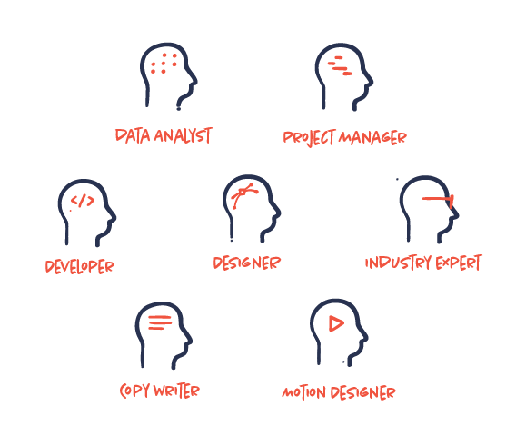
Information design is a complex and very multidisciplinary process. Although you might not have all the specialists on your team, you do need the skill sets of a wide range of specialists in order to make succesful high-end infographics.
The design process is not generic
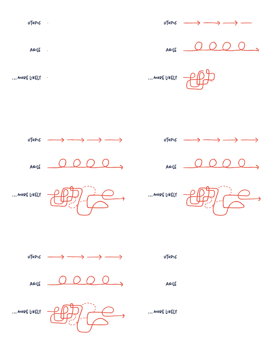
We often try to describe and visualize the design process in one simple, clear diagram. But the truth is, there’s no such thing. Projects vary a lot in terms of content, medium, industry, size, team etc., so the process will as well. Sure, there’s best practice to stick to throughout the process, but insisting that a “one-fits-all” model should be applied to every project is simply pie in the sky, as far as we’re concerned.
Don’t design for designers. Design for people.
Some designers tend to create designs that other designers will appreciate and applaud or design with their own taste and preferences in mind. With this approach your design risks being exclusive and, in the worst case scenario, disliked or misunderstood. Target your design for your main audience, who are most likely non-designers. Understand what works and appeals to your audience and ignore your designer friends.
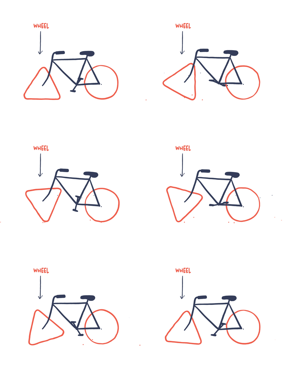
Don’t reinvent the wheel
Decoding an icon should not be a challenge for the reader. If you want the reader to recognize easily what your icon or illustration represents, follow the conventions and common comprehension. Design a wheel everyone immediately recognizes as a wheel.
Invest in sketching
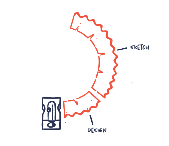
Sketching cannot be underestimated. It’s an essential part of the process‚ in which complex information is turned into clear visual ideas in rough, sketchy drawings. In many of our projects sketching actually ends up being the most time-consuming process – even more than design and production. But once the sketch is solved, designing and producing are the easy part.
Screen your content for visual potential
Screen your content to identify visual potential. Determine the content that will actually benefit from being visualized. It’s beneficial to get an overview of when visualizations make sense and when they don’t. Acknowledge that visuals aren’t always the answer and sometimes plain text might be more effective than visuals.

Format follows story
First establish the story you want to tell. Then choose your visual format. Not the other way around. From your visual toolbox choose the tool that does the job the best, whether photos, animation, text, sound etc. Don’t try to make your story fit into a predetermined visual format. The story and the purpose always come first.

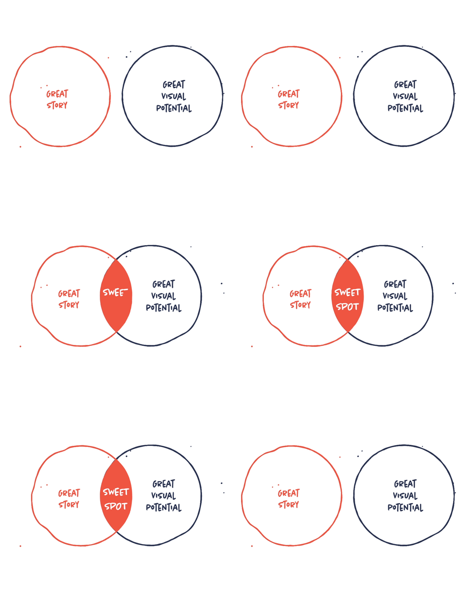
Find the infographic sweet spot
To create good information design you need to identify both a great story and great visual potential. Only having a great story to tell, doesn’t mean it’s suitable for being visualized. Nor does only having an interesting visualization of a subject make it a good story. So always make sure you have both before starting – otherwise reconsider whether you should do it at all.
If you can’t explain it simply, you don’t understand it well enough
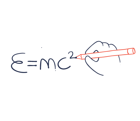
This quote may originate from Albert Einstein, but it’s also very true when it comes to the field of information design. Knowledge and insight are the key to good communication on any topic. Invest time in studying your subject thoroughly. If you don’t understand what you’re communicating, you won’t be able to challenge the content and transform it into more understandable visuals.
Simply figure out what to tell and how to tell it
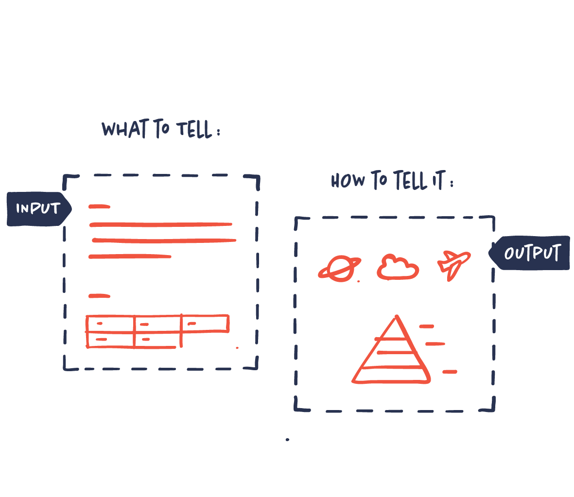
Basically, you only have to solve two things to succeed in powerful and persuasive information design: the what and the how. The what is choosing the right data and information that will make up your story in terms of research, priorities, focus etc. The how is solving the way in which your story and data will be communicated most effectively and powerfully in terms of design, creative visual ideas, style, format etc.
Always define a goal
Creating infographics or information design isn’t a goal in itself. Always define the end goal. The goal determines everything: which data to use, which story to tell, how to tell it, which style, what medium etc. Without a goal, you can’t tell whether it’s successful or not.
