
Dear Notebook reader,
We’ve been working with presentation design and slide decks for a decade now. We’ve failed. We’ve succeeded. But most importantly, we’ve learned.
At some point, we started to compile all the most important lessons we’ve learned in a little notebook — as a way to get smarter and make sure we didn’t repeat the same mistakes over and over. A few notes quickly became a lot, and this notebook was born. Basically, the notebook details everything you need to consider when making slides: lessons learned, insights, and dos & don’ts.
Based on our own experiences, we wanted to create useful, hands-on advice in a digestible format. We use the notebook ourselves in our daily work. So this notebook also gives you the opportunity to benefit from all the lessons we have learned and become even better at what you do.
Given that our knowledge and experience will keep evolving, so will this notebook. So follow our Instagram for updates.
We hope you enjoy our notebook!
All the best,
![]()
P.S. If you enjoy the notebook, you might be interested to know that we have also released a notebook on infographics and one on animation. You’re welcome!
The Notebook
on Presentations
Hard-earned insights from our notebook
about slides and presentation design.
Hands-on, honest and condensed.
Create a strong beginning
Every great movie needs a great opening scene to hook viewers from the start. Presentations are no different. If a presentation kicks off with a thrilling opener, the audience is more likely to stay engaged.
The opener could be a surprising act, an open question, a striking visual, an anecdote, an icebreaker — or whatever fits your style. Ideally, your opener should also capture the essence of your presentation and prepare the audience for what’s coming. But the most important thing is that the opener hooks your audience right away and keeps them engaged and excited to dig into the subject.

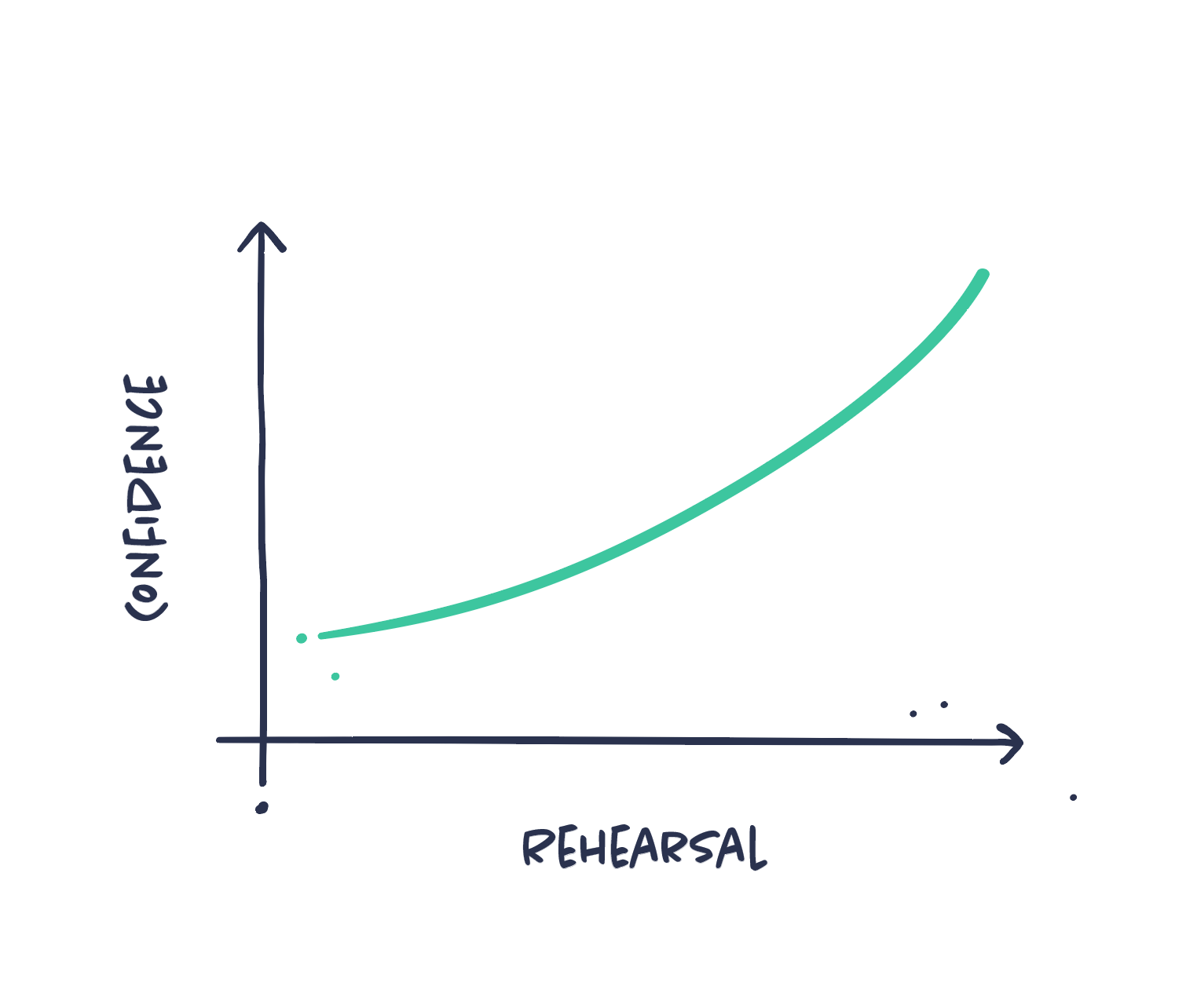
Practice and rehearse
You may have a fantastic story to tell, accompanied by an excellent slide deck, but the delivery is where it matters most. Have you ever wondered why Steve Jobs’ presentations were so good? Practice — he was humble enough to practice.
If you prepare well before the presentation, you will feel more relaxed and confident while presenting, and it will also improve your body language.
Implement practice into the process of any important presentation you will give. Practice could include rehearsing in front of a crowd, taking notes, experimenting with delivery, timing yourself, or recording yourself. All things that will help you perform and deliver significantly more convincingly. Any kind of practice is better than no practice at all.
Some things are more important than others – Prioritize your content
The first step with any content is to get an overview. What is crucial, and what is less so? It sounds easy, but prioritizing is often harder than it seems. Making these choices requires a deep understanding of your content and the story you’re trying to tell.
This basic prioritization is essential early in the process. It helps you determine where to focus your efforts and how to structure your presentation for a focused and concise delivery.

Use humour (in moderation)
Humour is a powerful tool to engage your audience, but it needs to be used wisely. Too much wit can detract from the message you are trying to convey and undermine your credibility. However, a well-placed joke or clever quip can make your audience react emotionally, listen more closely, and remember your message long after your presentation.
It is a delicate balance, but knowing your audience and the context is key. It should enhance your message, not detract from it. A genuine and engaging presentation is always more effective than forced or inappropriate humor.

Use effective pauses
Effective use of pauses is a master technique. It’s one of the most versatile tools in a presenter’s toolbox, yet very few people perform it well. A pause, if used correctly, can greatly enhance your presentation or speech.
Pause before, during, or after saying something you’d like to emphasize. Pausing between different parts of your presentation can signal to the audience that something new is coming. A quick pause could also help you remember your next point. Pauses are crucial to give your audience enough time to understand or read the content of your slides.

Avoid clichés
Visuals in your presentation should not be generic and vague but clear and exact. Clichés are often fluffy and defocused and should therefore be avoided, if possible. Visual clichés are usually the result of lazy design rather than best practice. Try to challenge the most common and prosaic ideas and choose visual representations that are both distinctive and accurate. No more light bulbs and puzzle bricks!

Match your message and visuals
Text and visuals should be intertwined. The message should support the visual, and the visual should support the message. This advice seems basic, but slides often fail in this regard. You might have a visual on the topic — a figure, a statistic, or some other content — but that doesn’t necessarily mean it effectively conveys your message. So don’t forget to ask yourself: Are the visuals and text in sync, and are they complementing each other?

Slides don’t (necessarily) need text
A picture is worth a thousand words; a cliché, but a true one. Let go of the idea that every slide needs text or even a headline, at least in the context of a verbal presentation.
A powerful visual like a picture or an illustration can be even more effective without explanatory text. Break the template and use visuals to set a mood or tell a visual story. Allow the visuals to speak for themselves.

State your purpose
The first thing your audience wants to know is: Why are we here? What’s the purpose of this presentation? Be crystal clear about your subject matter and your objective. In just a few sentences, communicate the main takeaways and the value your audience will gain from listening. Let them know upfront what to expect, and they’ll be more likely to stay engaged.

Stock templates are junk food
Using flashy slide templates might look like an easy way to get a professional presentation. But it’s almost always a bad idea, even if you need a quick, cheap solution.
Templates have several drawbacks. They limit your design, make your presentation look generic, and force you to fit your content into their structure. This can result in a presentation that looks inconsistent or unprofessional. Most importantly, you lose the chance to make a presentation that perfectly fits your message, content, brand, and audience. So, to sum it all up: just don’t use them.

Separate slides and notes
A common mistake is to treat your slides as a container for both your presentation and your notes.
Having separate notes or cue cards can be a great idea for structuring and memorizing your presentation. But keep a clear distinction between content for your audience and content strictly for you as the presenter. Instead, make use of speaker notes for cues, support, and additional information.

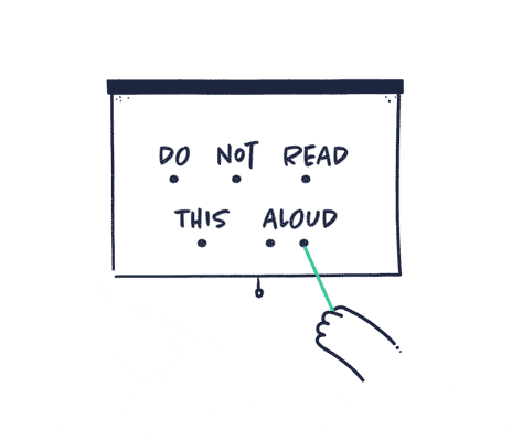
Do not read from your slides
Don’t face the screen and read your slides. The audience can read for themselves. While it’s crucial to have a well-structured outline, reciting it word-for-word can lead to disengagement and boredom.
Your slides should complement your words, not replace them. Instead, use the slides as prompts to guide your presentation or to help you pace yourself. This approach allows you to maintain eye contact and connect with your listeners.
Don’t just lecture: interact!
Presentations risk becoming a long, tiresome, and passive experience for the audience, even if the topic is exciting. Avoid simply lecturing. Instead, aim for a dynamic and interactive approach. Engage your audience in active discussions, and incorporate interactive elements.
For example, use open-ended questions, conduct a poll, or present a challenge by asking your audience how they would address a specific issue. Any activity that breaks up the presentation and encourages audience participation is beneficial.

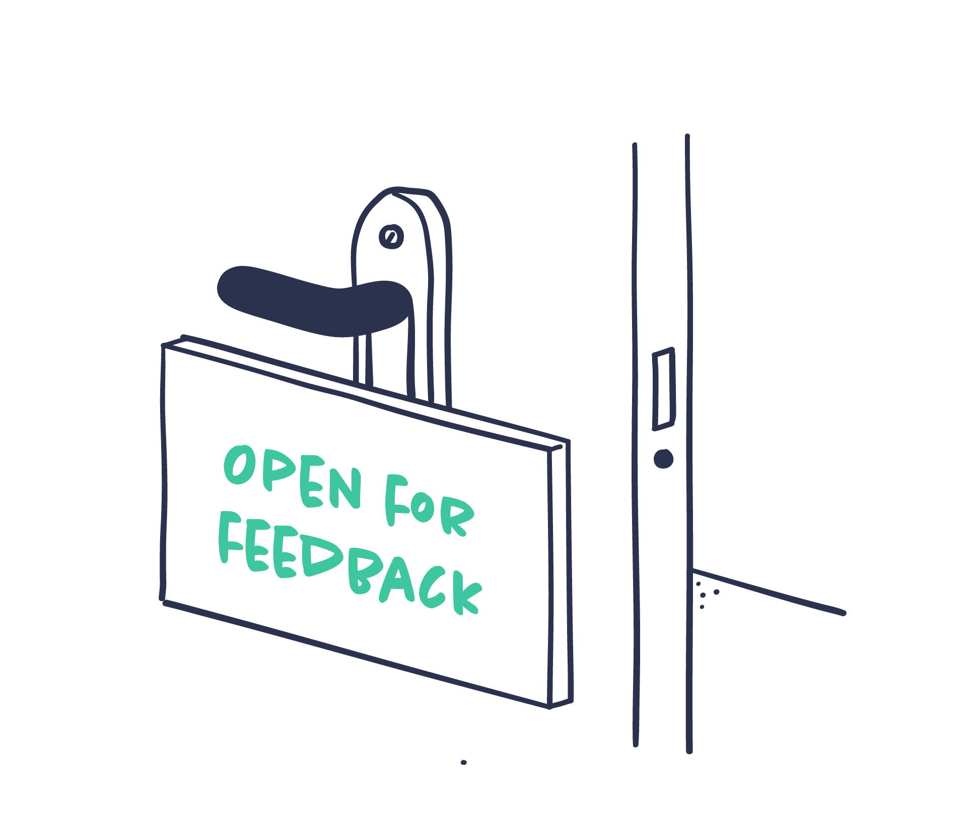
Get feedback
Don’t rely solely on your own understanding and perspective. Seek feedback from others. Getting input from someone unfamiliar with the subject can help you identify areas where the presentation may be unclear or confusing. Embrace feedback as an opportunity to improve your presentation and slides and make your message more effective.
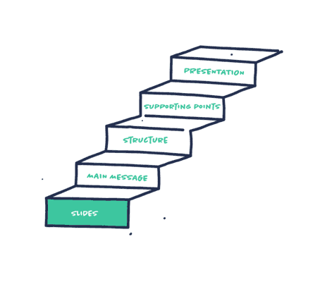
Identify your key visuals
Not all slides are equally important. Your presentation is likely built around a few key ideas, and your key visuals should capture these ideas. Focus your effort on these key visuals, as these are what your audience should remember long after your presentation. Make these visuals your top priority; everything else is secondary.

Begin with a Script
Before diving into slides, take a step back and write a script for your presentation. Outline your story, structure, and delivery. Start with a Word or Google doc and create a detailed outline or script for the entire presentation. This will help you visualize the flow of information and how your audience will experience it.

Tell one coherent story
A coherent narrative should be the backbone of a compelling presentation. While each slide can have a clear individual message, the true power lies in weaving them into a single, compelling story. This will guide your audience and connect disparate points, making your message memorable. Without it, your presentation risks becoming a jumble of facts. A strong narrative arc keeps the audience engaged and invested throughout.

Escape slide monotony
A repetitive slide deck will make it difficult to keep your audience’s attention, make your messages memorable, and differentiate the slides from one another.
You might have similar content throughout your deck, but strive to present it in a captivating and engaging way. Diversify slide types, design, and backgrounds to help your audience distinguish between them. The goal is to create a memorable presentation where each idea stands out.
Loop your animations
Integrating videos into presentations can be tricky. A good alternative is to use GIFs or short, looping videos. These allow you to present while the animation plays, seamlessly adapting to the length of your speaking, without the interruption of sound or a defined beginning and end.

Do your slides as the last thing
Many keynote speakers rely on slides to structure their presentations. While a beautiful set of slides is essential for a successful presentation, they should not be the core focus. Ideally, they should actually be the last element you create. Before designing your slides, define your core message, structure, and supporting arguments. This ensures your presentation is compelling and can stand on its own, even without visuals.
This approach demands a shift in perspective: prioritize your message, then determine how to best present it visually.
Design for context
Keep the context in mind when creating your slides. In a presentation, your slides should complement your spoken words. Use them to display visuals like charts and graphs, highlight key takeaways with large text, and reinforce your main points.
As a handout, slides become a reference document. In this case, include more detailed information, data, or explanations to ensure they stand alone.
If your slides will serve both purposes, consider creating two separate versions tailored to each context.

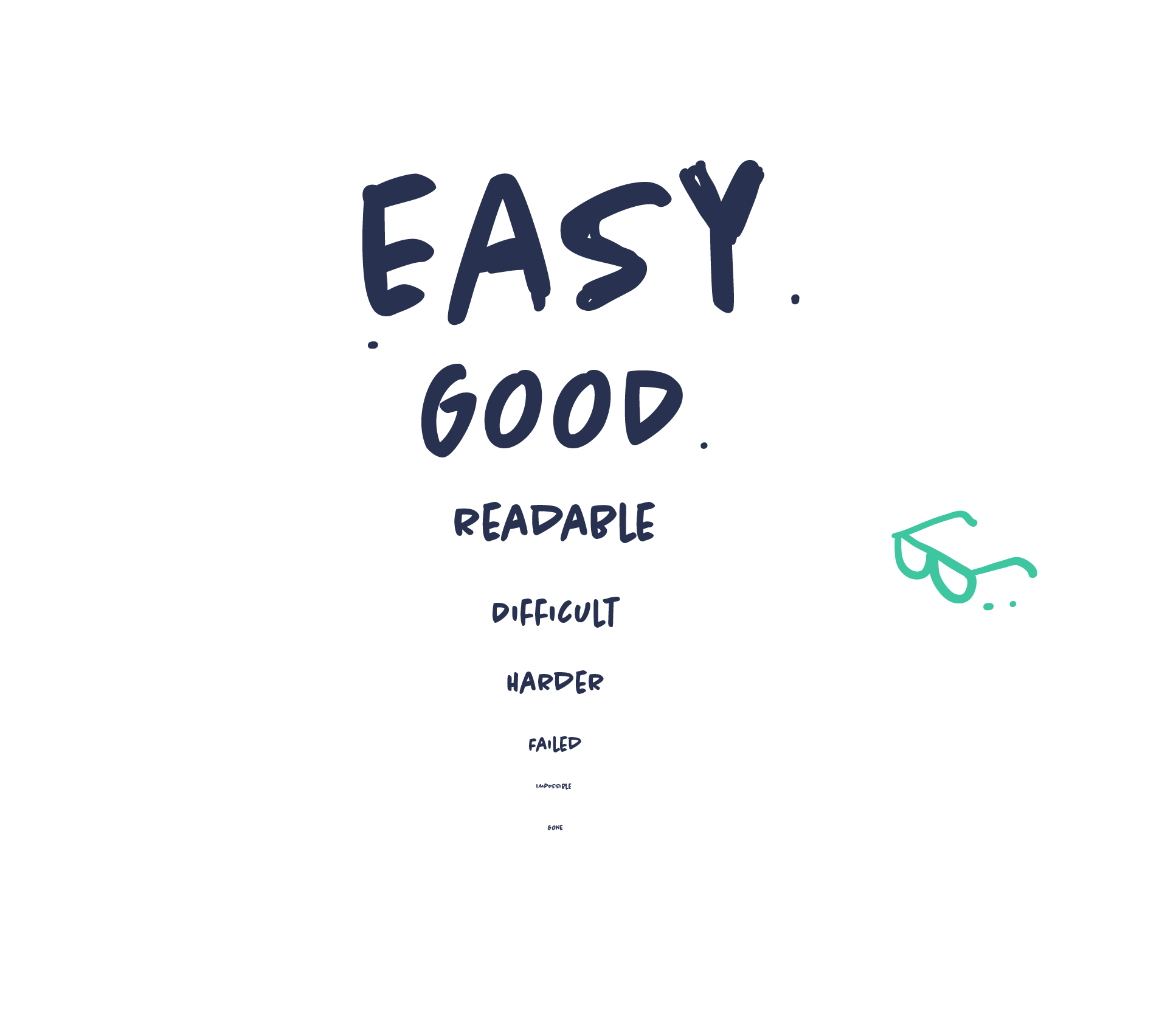
Readability first
Prioritise readability in your presentation design. Often, small font sizes are chosen to cram in more text, or poor design choices prioritize aesthetics over function. Consider your presentation environment. Will you be presenting in a large room? How is the lighting? Will the presentation be viewed on mobile devices? These factors all impact readability. Ensure your text is easy to read in any context by considering font size, contrast, and background.
Turn off the presentation
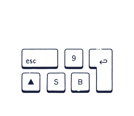
To add impact to your presentation, shift the focus from the screen to you as a presenter. Turn it off for a while to make your audience focus on you, your gestures, and what you are saying. This technique offers several benefits, such as creating variety, maintaining audience engagement, building a better connection with the audience, and avoiding unnecessary or distracting slides. Remember, not everything needs a slide. Make conscious choices about when to use visuals. As a helpful hack, press B or PERIOD to instantly black out the screen and bring the focus back to you.

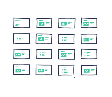
Elevate your slides with content variety
Slide decks offer a remarkably flexible format and can include a variety of content, such as images, animations, charts, text, illustrations, GIFs, and sound. However, avoid overloading your slides. Instead, carefully curate the content that best suits each part of your presentation. Strive for creativity and impact, selecting content that resonates with your audience and effectively conveys your message.

Choose your titles well
Good titles for your slides can not be underestimated. A well-crafted title helps both you and your audience understand the key message of each slide. Titles should be short and distinct to make your point clear. Avoid generic titles that could be applied to any slide of the same type. Instead, aim for titles that are memorable and engaging. Take the time to craft compelling titles that capture attention and guide your audience through your presentation.
With text, less is always more
In a presentation, slides are meant to support your talk. Therefore, there’s no need to include more text than necessary, as it will make your audience try to read it while listening to you. You can add a title, but keep the rest of the textual content short and to a bare minimum. Clear headings and short sentences, one for each main takeaway, can be enough. Let the slides “show” while you “tell.”

Keep it consistent
Consistency is crucial for any presentation — consistency in terms of tone of voice, layout, imagery, and everything else. It’s easy advice to give but hard to achieve and maintain. More often than not, we end up with something that looks more like a patchwork quilt. This is especially true if you add slides from other presentations.
Color schemes from other documents, misaligned text, varying fonts, and other inconsistencies can afflict your presentation, especially when it’s being built collaboratively. Keep an eye on the overall look and feel of your presentation, as well as the formatting details, to create a consistent and cohesive whole.

Split your slides
It’s a misconception that you have to limit the number of slides. Doing so forces you to fit multiple stories onto one slide. This is bad for two reasons: First, it creates overcrowded slides. Second, it makes it difficult for your audience to focus, as they are exposed to multiple sub-stories simultaneously.
You won’t save any presenting time and it can actually be less effective. Instead dedicate one full slide to each point. While your slide count will increase, your effectiveness in communicating those ideas will likely increase because your audience will be focused on one single idea rather than juggling three different ideas at a time.

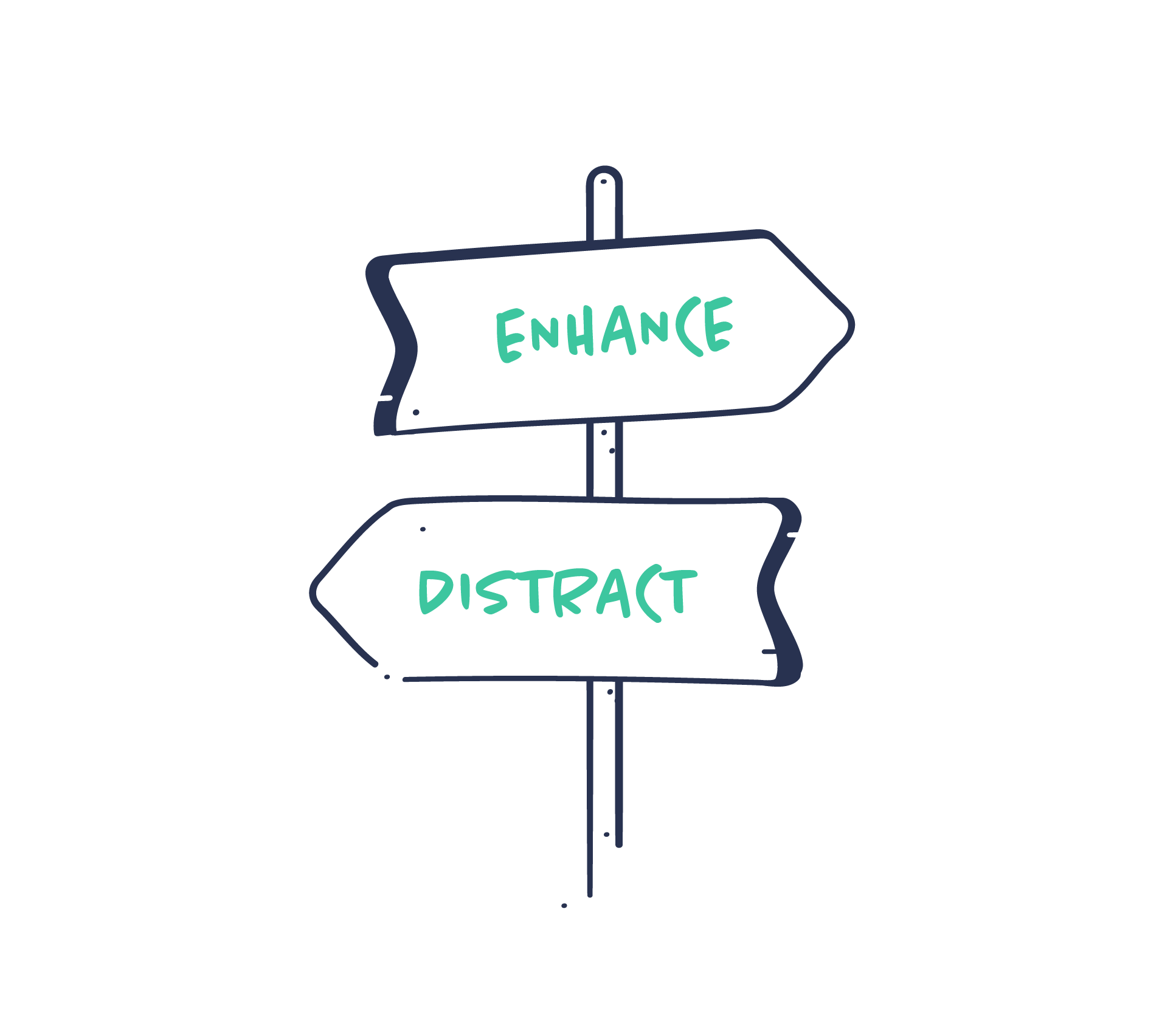
Visuals should enhance meaning
Visuals like photos and illustrations are powerful assets in your presentations. They can support and enhance your message. But random or poorly chosen visuals can do the opposite: distract, miscommunicate, or clutter your message. A metaphor that is too abstract, too concrete, or inaccurate can also be detrimental. It should be absolutely clear why the audience is exposed to a visual and why it’s paired with your message. So use simple, distinct visuals that enhance meaning rather than blur it.
White space will make your slides breathe
It can be tempting to maximize your slides; to add more visuals, another quote, or some additional text for context—all to ensure your point comes across. But by doing so, you force yourself to fit more content into less space. This will likely result in dense and cluttered slides with poor readability.
Force yourself to include only one visual and one headline, and let your slides breathe with plenty of white space. Minimal and concise slides help your audience focus and will make your message clearer and more memorable.

Learn to navigate your presentation non-linearly
A presentation isn’t always linear. Practice moving backward and forward within your presentation. Your audience may want to see a previous slide, or you may want to skip ahead to something relevant. PowerPoint allows you to move back and forth without paging through interim slides.
Know these shortcuts:
Space/Enter/Right arrow for the next slide; Backspace/Left arrow for the previous slide; 5 + Enter to go to slide 5; B to display a black screen; S to stop or restart an automatic slide show.
Build a dramatic structure
Think of your presentation as a story. Presenting an idea within a narrative allows your audience to engage with it. Presentations are no exception.
Create a basic skeleton to help you build a dramatic structure. This structure can vary, depending on your content, your audience, and the setting, of course. But simply by following a classic three-part story structure (beginning, middle, and end), you can create a more engaging message that is easier to digest, remember, and retell.

Kill the bullet list
The bullet list might be the single most (over)used slide type — and for good reason. It’s easy to use and very versatile. But it’s also a very generic type of slide, and more often than not, it’s not an effective way of delivering information memorably, as it can make your audience struggle to pay attention.
Challenge the bullet list and find alternatives. Try to create one slide for each item on your list. If you can’t create one slide for each item, present a highly visual list. Be creative with the layout and visuals. Actually, just anything but the bullet list!
