Ferdio
1 Dataset. 100 Visualizations.
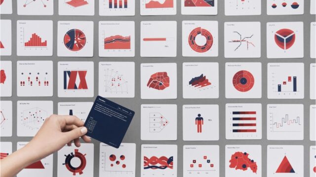
Every time we turn a set of data into a visual representation, hundreds of design choices have to be considered in order to make the data tell the best story possible. Many of the choices are unconscious, often resulting in similar solutions. The obvious and uninspired. This project goes beyond common solutions and best practice. It demonstrates how even the simplest dataset can be turned into 100 proper data visualizations telling different stories, using very limited visual properties and assets.
Enlighten people to make better choices
As an information design agency working with data visualization every day, we challenged ourselves to come up with 100 visualizations from one simple dataset using insightful and visually appealing visualizations. We wanted to show the diversity and complexity of data visualization and how we can tell different stories using limited visual properties and assets.
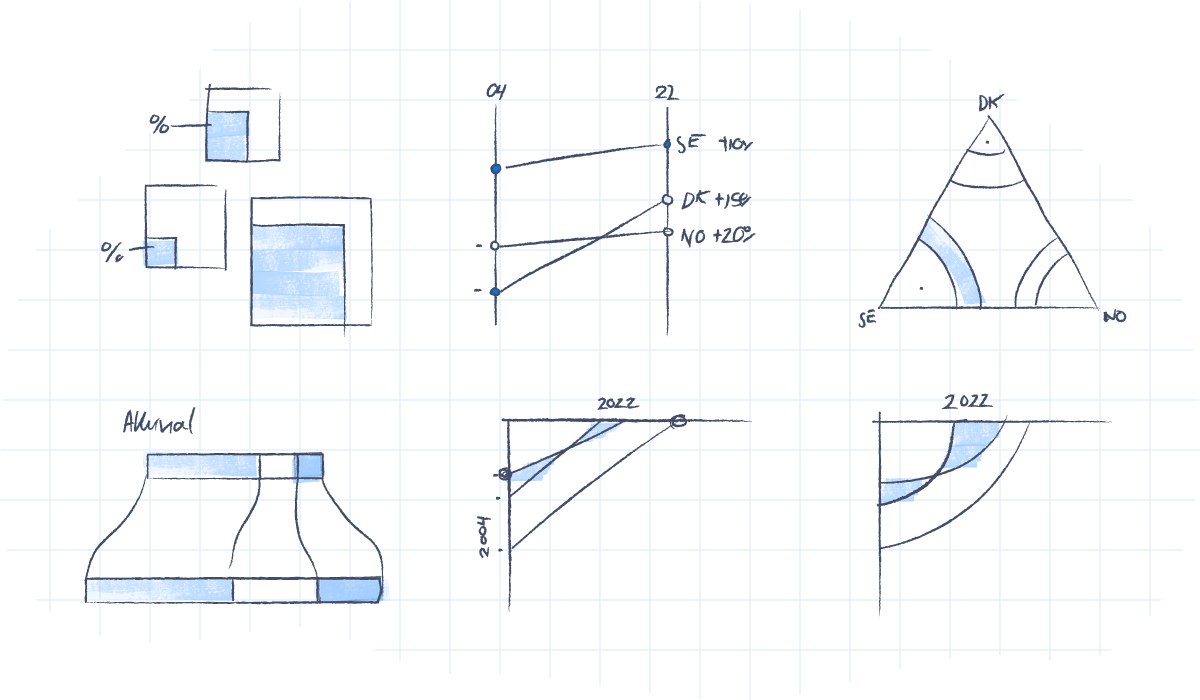
We didn’t start this project to show off, but rather to show how interpretation can create better results. Take a close look at your dataset and figure out what the main story in your data is. Different approaches and focuses demand different visualizations. We decided to keep every visualization the same style and colors and let the interpretation and story angle dictate the visualization. This resulted in 100 vastly different visualizations.
Simple yet functional
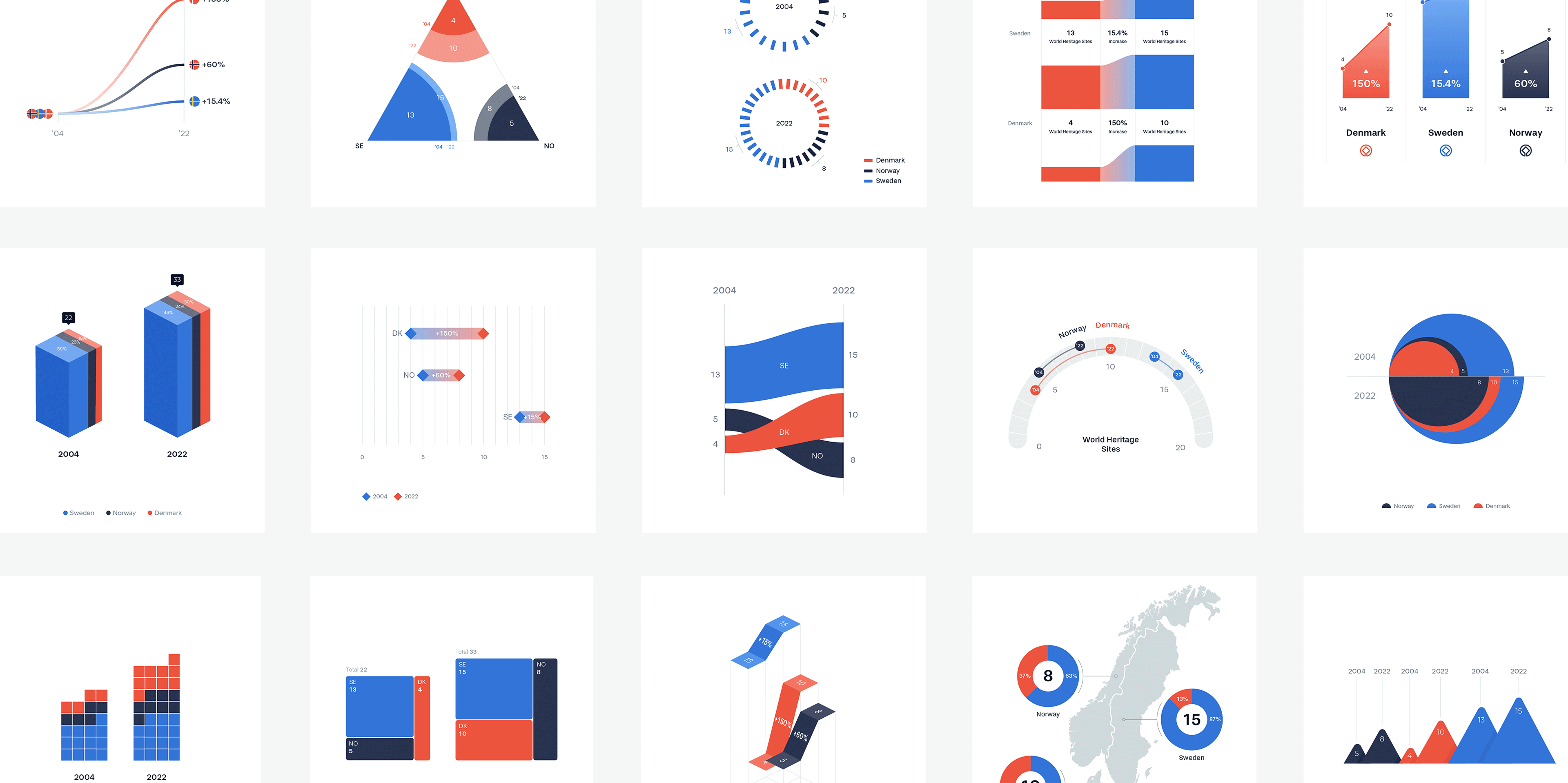
For the challenge we chose a very simple dataset – although complex enough for interpretation. The dataset includes multiple statistical aspects such as comparison, development, distribution, etc. The dataset compares the numbers of UNESCO World Heritage Sites in Scandinavia in 2004 and 2022.
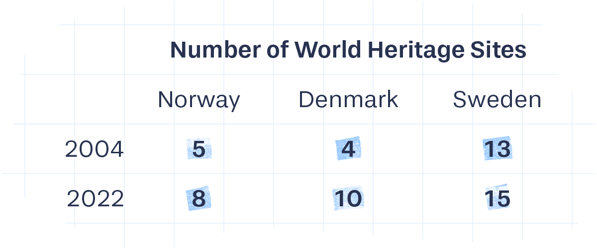
The visual toolbox
For the data visualizations, only a small selection of very basic visual properties were used to transform data into visual: scale, length (height/width), position, and amount.
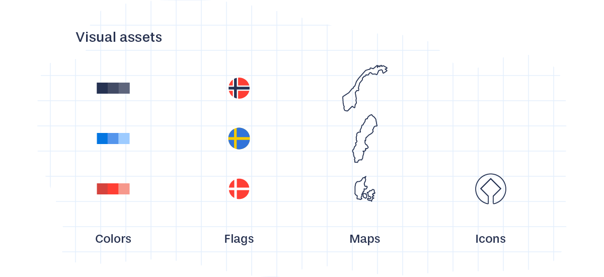
A limited set of visual assets were also used: colors, shades, flags, maps and the UNESCO World Heritage icon. Mostly for visual differentiation and labeling. This constitutes a limited yet powerful, visual toolbox, large enough to come up with 100 visualizations.

The website is part of Data Viz Project, our collection of data visualizations to get inspired and find the right visualization for your data. You can follow Data Viz Project on Instagram and Facebook.


