Ferdio
Data Viz Project – The most comprehensive archive of data visualizations
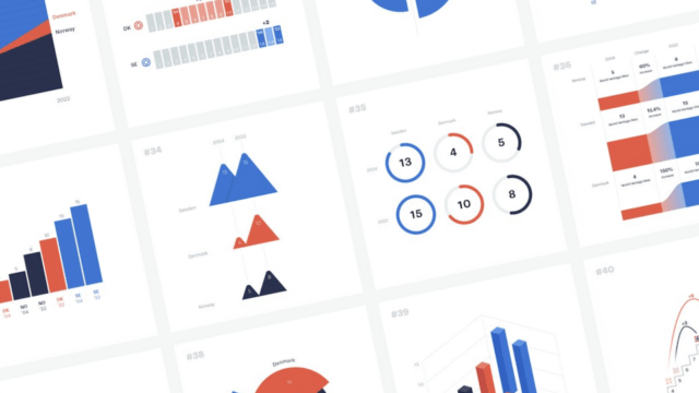
Data Viz Project is the world's biggest library of data visualizations. The website presents the most relevant and popular visualizations so you can find the right one and get inspired.
Project type
Background
The Data Viz Project is as old as Ferdio. Started as a simple side-project, but turned out to become of great importance and value to us followed by the rest of the world working with data visualizations.Content
Size matters
We wanted to create a complete catalogue of data visualizations. With more than 165 data visualizations (still counting), it’s the most comprehensive collection. But at the same time it was also important to make sure that definition, naming, examples and categories were correctly carried out and not just a matter of numbers.
Inspiration
Get inspired
We wanted to create a resource to get you inspired by the many ways to visualize data. A bar chart is not simply a bar chart. So for each data viz we’ve collected interesting and creative examples from actual projects, so you don’t have to do the work. Some users actually referred to this feature as the Pinterest of data visualization.
Search
Search your way
We wanted to create a tool that made it easy to find the relevant data visualization. Maybe you know the name, or the function, or you have no idea, but only a specific set of data. Therefore we established a data viz taxonomy and incorporated multiple search options to accommodate these different user scenarios.
Beginnings
Post-it sketches kicked it off
Without knowing it was an actual project, we simply started sketching post-it-sized prints of most used data visualizations as an internal tool for our client projects. 10 became 50, then 100, and quickly our office wall was covered in paper dataviz. This is we’re we realised the potential, and 4 years and hundreds of hours later of research, design, development, QA, we were able to share the project with the world.

New formats
Shaping up
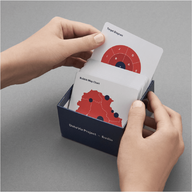
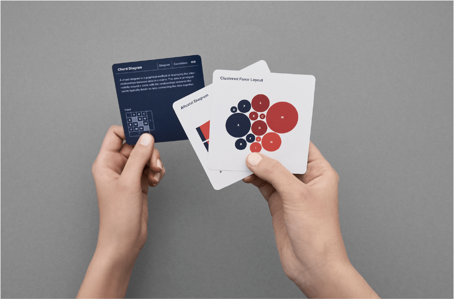
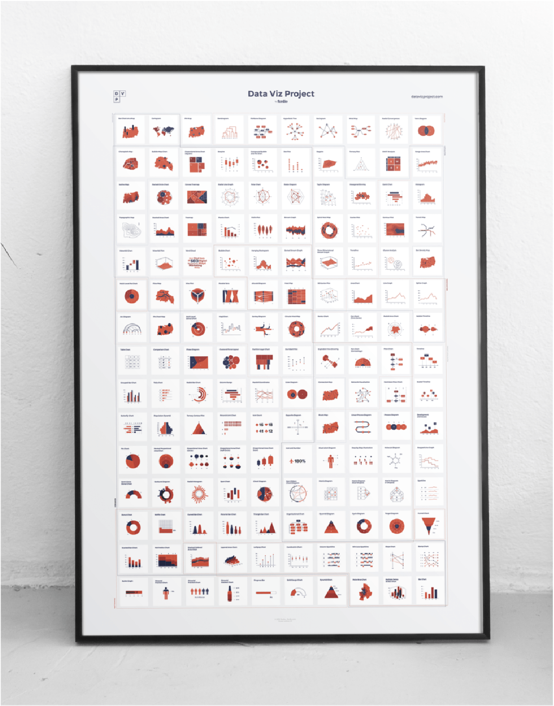
In general we want DVP to help people make better decisions with data visualization. Since people are using DVP in different ways, we want to tap into this. Currently DVP is a website, but it doesn’t mean it’s limited to this format. We’re constantly looking into how to adapt to other contexts. And due to the constant interest and feedback we’re receiving, new formats are in the making including cards, posters, exhibitions, publication among other things.
Acknowledgment
Widespread recognition
Two million web visitors, five awards, massive media coverage. The interest and reactions have been overwhelming. Still are. But most importantly we appreciate all of the continuous messages in our inbox and social media mentions of how people enjoy and make use of the DVP whether it’s students, professionals or another data cruncher. Keep ‘em coming.
20+
Mentions in online media and books in more than 6 languages
2,000,000+
Visitors on datavizproject.com since launch
2
Awards including Malofej, Kantar Information Is Beautiful Awards, FastCompany’s Innovation by Design Awards

