Dear Notebook reader,
We’ve been working in the field of infographics and visual information for a decade now. Every single day we turn data and information into powerful visual communication. We’ve failed. We’ve succeeded. But most importantly, we’ve learned.
At some point we started to compile all the most important lessons we’ve learned in a little notebook – as a way to get smarter and make sure we didn’t repeat the same mistakes over and over. A few notes quickly became a lot, and this notebook was born.
Basically, the notebook details everything you need to consider when working with information design: lessons learned, insights and dos & don’ts. Based on our own experiences, we wanted to create useful, hands-on advice in a digestible format.
We use the notebook ourselves in our daily work. So this notebook also gives you the opportunity to benefit from our all the lessons we have learned and become a better information designer.
Given that our knowledge and experience will keep evolving, so will this notebook. So follow our Instagram for updates.
We hope you enjoy our notebook!
All the best,
![]()
The Notebook
on Infographics
Hard-earned insights from our notebook
about infographics and information design.
Hands-on, honest and condensed.
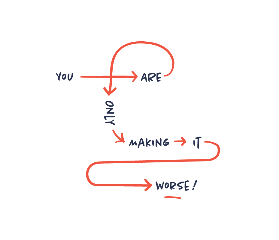
Watch out for the cobra effect
The cobra effect occurs when an attempt to solve a problem makes the problem worse as an unintended consequence. When solving a communication problem, this can easily happen when you try to simplify complex information. The information that was initially difficult to understand is now utterly incomprehensible. This means that you need to start over or even kill your infographic.
Simple ≠ simplistic
We aim to make complex information simple and easy to understand. That’s simplicity: when you can identify what’s essential and eliminate the rest. Simplistic on the other hand is when you treat complex issues as if they were much simpler than they are. There’s a clear distinction. Complexity is never eliminated but can only be reduced or concealed. Or in the words of Albert Einstein:
“Everything should be as simple as possible, but not simpler”.
Format follows story
First establish the story you want to tell. Then choose your visual format. Not the other way around. From your visual toolbox choose the tool that does the job the best, whether photos, animation, text, sound etc. Don’t try to make your story fit into a predetermined visual format. The story and the purpose always come first.
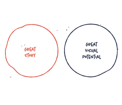
Find the infographic sweet spot
To create good information design you need to identify both a great story and great visual potential. Only having a great story to tell, doesn’t mean it’s suitable for being visualized. Nor does only having an interesting visualization of a subject make it a good story. So always make sure you have both before starting – otherwise reconsider whether you should do it at all.
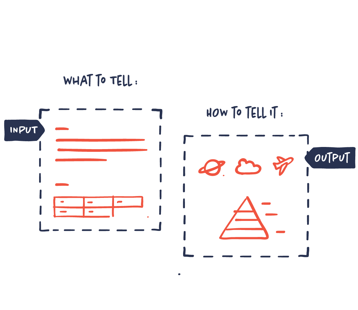
Simply figure out what to tell and how to tell it
Basically, you only have to solve two things to succeed in powerful and persuasive information design: the what and the how. The what is choosing the right data and information that will make up your story in terms of research, priorities, focus etc. The how is solving the way in which your story and data will be communicated most effectively and powerfully in terms of design, creative visual ideas, style, format etc.
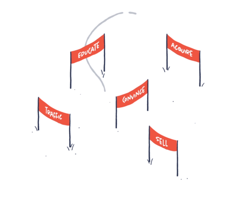
Always define a goal
Creating infographics or information design isn’t a goal in itself. Always define the end goal. The goal determines everything: which data to use, which story to tell, how to tell it, which style, what medium etc. Without a goal, you can’t tell whether it’s successful or not.