Dear Notebook reader,
We’ve been working in the field of infographics and visual information for a decade now. Every single day we turn data and information into powerful visual communication. We’ve failed. We’ve succeeded. But most importantly, we’ve learned.
At some point we started to compile all the most important lessons we’ve learned in a little notebook – as a way to get smarter and make sure we didn’t repeat the same mistakes over and over. A few notes quickly became a lot, and this notebook was born.
Basically, the notebook details everything you need to consider when working with information design: lessons learned, insights and dos & don’ts. Based on our own experiences, we wanted to create useful, hands-on advice in a digestible format.
We use the notebook ourselves in our daily work. So this notebook also gives you the opportunity to benefit from our all the lessons we have learned and become a better information designer.
Given that our knowledge and experience will keep evolving, so will this notebook. So follow our Instagram for updates.
We hope you enjoy our notebook!
All the best,
![]()
The Notebook
on Infographics
Hard-earned insights from our notebook
about infographics and information design.
Hands-on, honest and condensed.
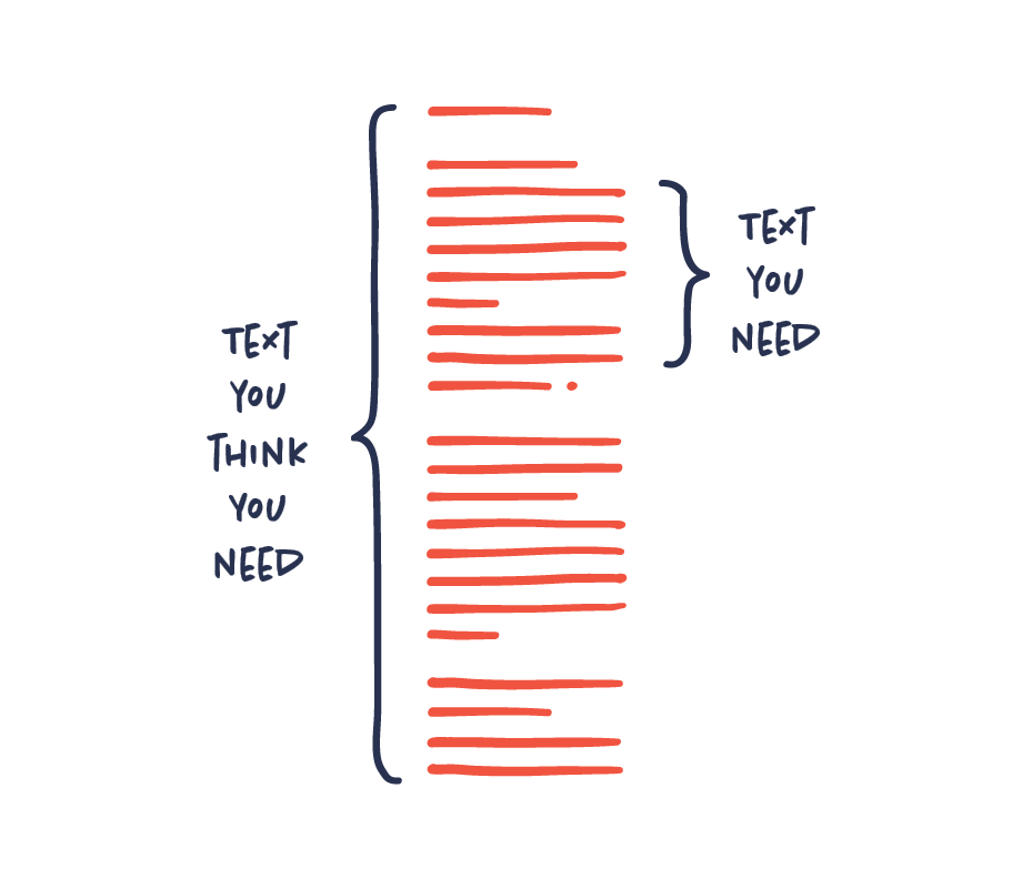
Avoid information overload
So much to say, so little space? For fear of leaving out important information, you run the risk of cramping too much information into too little space.
But the risk is that the more you add, the more difficult it will be for your audience to digest and to remember your key message. Trust that your main story is good enough and be critical as soon as your infographic starts to overload. Don’t hide your key message in a haystack!
Your infographic is too text-heavy
Nobody wants to read an infographic that is text-heavy. It kind of ruins the whole point of having an infographic in the first place.
Aim to use as little text as possible. In most cases, the less text you need to communicate your message the better. If you feel like you need a lot of text to get your message across, it may in fact point to a problem with your infographic.
Some things are more important than others – Prioritize your content
The first thing to do with all your content is to get an overview. What is very important and what is less important? This basic prioritization is essential when scripting, sketching and designing. It sounds easy, but prioritizing is usually harder than it sounds. Making these choices requires a deep understanding of your content and the story you are trying to tell.
Story is king
You can’t turn a poor story into a great infographic. No matter how much you’re trying to add cool, magical and brilliant design, it’ll still be a poor story wearing fancy cosmetics. Design simply can’t rescue failed content.

Dig deep to identify the essence
The pile of information on your subject may be extensive and you need to dig a lot before actually finding what you’re looking for. This dirty work includes everything from arranging and researching to identifying and prioritizing the information. All this work can be time-consuming, but necessary in order to extract just the information you need for making concise and powerful information design.

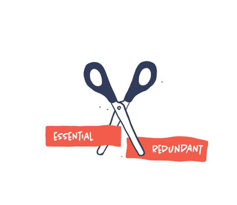
Trim, trim, trim
The constant struggle for any project in information design is to trim your content, so we’re left with only the essential information, and everything redundant is left out. Keep asking: Is it essential to the story? If not, leave it out. A perfectly trimmed story will be sharper and more powerful.
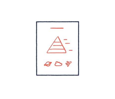
Screen your content for visual potential
Screen your content to identify visual potential. Determine the content that will actually benefit from being visualized. It’s beneficial to get an overview of when visualizations make sense and when they don’t. Acknowledge that visuals aren’t always the answer and sometimes plain text might be more effective than visuals.

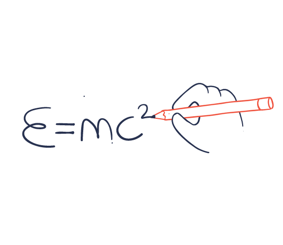
If you can’t explain it simply, you don’t understand it well enough
This quote may originate from Albert Einstein, but it’s also very true when it comes to the field of information design. Knowledge and insight are the key to good communication on any topic. Invest time in studying your subject thoroughly. If you don’t understand what you’re communicating, you won’t be able to challenge the content and transform it into more understandable visuals.