Dear Notebook reader,
We’ve been working in the field of infographics and visual information for a decade now. Every single day we turn data and information into powerful visual communication. We’ve failed. We’ve succeeded. But most importantly, we’ve learned.
At some point we started to compile all the most important lessons we’ve learned in a little notebook – as a way to get smarter and make sure we didn’t repeat the same mistakes over and over. A few notes quickly became a lot, and this notebook was born.
Basically, the notebook details everything you need to consider when working with information design: lessons learned, insights and dos & don’ts. Based on our own experiences, we wanted to create useful, hands-on advice in a digestible format.
We use the notebook ourselves in our daily work. So this notebook also gives you the opportunity to benefit from our all the lessons we have learned and become a better information designer.
Given that our knowledge and experience will keep evolving, so will this notebook. So follow our Instagram for updates.
We hope you enjoy our notebook!
All the best,
![]()
The Notebook
on Infographics
Hard-earned insights from our notebook
about infographics and information design.
Hands-on, honest and condensed.
Avoid clichés
Visuals should not be generic and vague but clear and exact. Clichés are often fluffy and defocused and not concise enough and should therefore be avoided, if possible. Visual clichés are usually the result of lazy design rather than best practice. Try to challenge the most common and prosaic ideas and choose visual representations that are both distinctive and accurate.

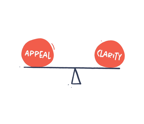
Balance appeal and clarity
Your visuals should be concise and easy to understand. You also want your visuals to be appealing, interesting and able to evoke emotions. Appeal and clarity are not contradictive. But sometimes more clarity can lead to less appeal and vice versa. It is your job to balance the two in order to make truly appealing and concise visual communication.
Consider cultural norms
Visual communication is not a universal language. Cultural differences in interpretation are more prevalent than you would think. What symbolizes freedom in Europe or how a family home is illustrated might not be the same in Asia. We need to pay careful attention to all of these subtle differences in different cultures and different target audiences.

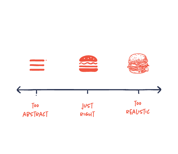
Not too abstract, not too realistic, just right
An illustration can easily be too complex or realistic for communicating a message concisely. On the other hand, it can also be too simple and abstract to understand. Cristoph Niemann introduced The Abstract-O-Meter as a scale to demonstrate how illustrations need to have this perfect balance, in which there’s just the right amount of information to be perceived effectively.
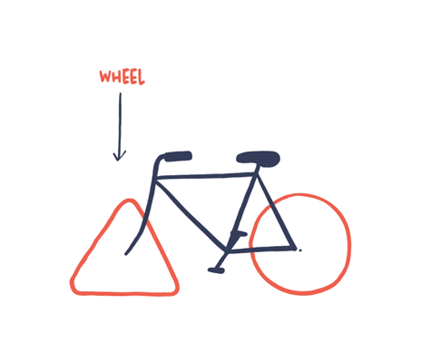
Don’t reinvent the wheel
Decoding an icon should not be a challenge for the reader. If you want the reader to recognize easily what your icon or illustration represents, follow the conventions and common comprehension. Design a wheel everyone immediately recognizes as a wheel.