Dear Notebook reader,
We’ve been working in the field of infographics and visual information for a decade now. Every single day we turn data and information into powerful visual communication. We’ve failed. We’ve succeeded. But most importantly, we’ve learned.
At some point we started to compile all the most important lessons we’ve learned in a little notebook – as a way to get smarter and make sure we didn’t repeat the same mistakes over and over. A few notes quickly became a lot, and this notebook was born.
Basically, the notebook details everything you need to consider when working with information design: lessons learned, insights and dos & don’ts. Based on our own experiences, we wanted to create useful, hands-on advice in a digestible format.
We use the notebook ourselves in our daily work. So this notebook also gives you the opportunity to benefit from our all the lessons we have learned and become a better information designer.
Given that our knowledge and experience will keep evolving, so will this notebook. So follow our Instagram for updates.
We hope you enjoy our notebook!
All the best,
![]()
The Notebook
on Infographics
Hard-earned insights from our notebook
about infographics and information design.
Hands-on, honest and condensed.
Use and exploit your basic visual toolbox
Data visualization is all about converting data into meaningful and effective visual representations. In order to do so, you need to become familiar with your toolbox of visual assets like size, color, direction, etc. Don’t use all at once but choose and experiment to find the most effective for the task.

Avoid chartjunk
Chartjunk refers to visual elements in charts that are redundant in conveying information or even distracting to the viewer, making the chart more difficult to understand.
There is a fine line between when visual elements are helpful and beneficial and when they turn into chartjunk. Visual elements should always support the story and communication rather than disturb the message.
Leave out superfluous information
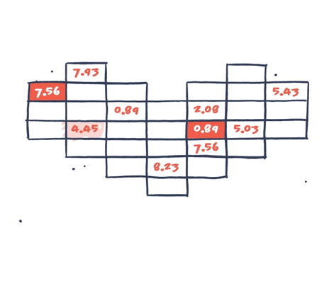
Data visualizations are often more complex than they need to be: A way to detailed axis, fine meshed grid lines that are unnecessary or additional technical details that just blur the core message. The more superfluous information you include, the harder it is to decode the information and the key message. Leave out all superfluous information and include only the information necessary or helpful for comprehension.

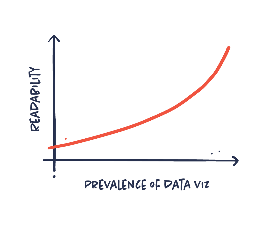
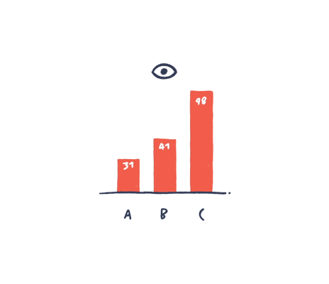
Use common data visualizations for common understanding
Information designers sometimes tend to favor more exotic and artistic data viz types. Though this can be inspiring and useful, it is important to be aware of the readability and function of the chart types. Basic data visualizations like a bar chart or a line graph work because everyone knows how to read them. Choose the data viz type that conveys the message the best and the one that your audience will understand.
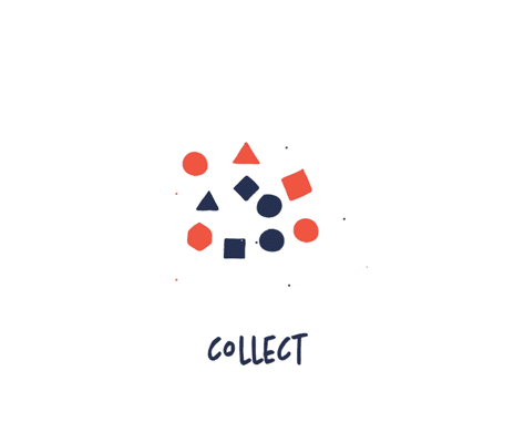
Collect, sort, analyze, visualize
These are the most important steps in data visualization (in most cases):
-
Collect the data. Which data is relevant?
-
Sort the data. How is the data connected?
-
Analyze the data. Are there any significant patterns?
What is the story? -
Visualize the data.
How do we visualize the story most effectively?
Your tools should not decide what your visual should look like
In recent years, we have been flooded with amazing new data visualization tools. It is easier than ever before to exploit these tools. They are often used to make advanced and heavy data viz that would have been almost impossible to make before. But just because it is possible, doesn’t mean that it’s a good idea. The story you want to tell should decide how you visualize your data not your tools. The visualization should underline your story and not be more complex than necessary to communicate the message.
Follow the rules, bend the rules
You need to know and master the basic rules and best practice for data visualization. But there are always exceptions to the rules. There will often be cases or circumstances where you need to bend the rules – or even ignore them —to achieve the best results. The art is to know when to follow the rules and when to bend them. Start by the following the rules and only bend them when it is necessary to communicate your message better and more effectively.
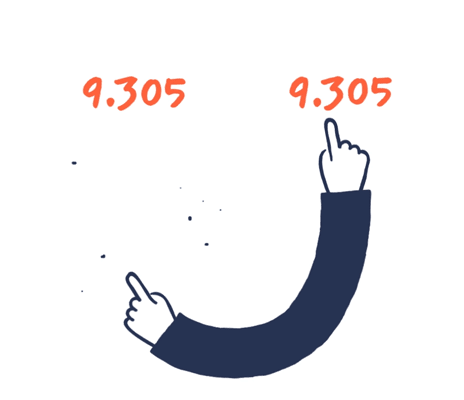
Double-check your data
Data is fragile to human imperfection and you need to be cautious and thorough with your data and data visualization. This goes without saying, but nevertheless, it is relevant advice to most of us. It is easier to check than to fix or change later once the data has been published. Double-check your data and sources and make sure that your visualizations and numbers are in sync.
Do the squint test
We often get lost in our own work, lost in details, unable to see if our design actually works as intended. The squint test is a quick way to check the effectiveness of your visuals. Look at your infographic, squint your eyes until all of the text is blurred. Do you still get the purpose? What attracts your attention? Does the overall composition make sense? Is the hierarchy right? Could something be left out?
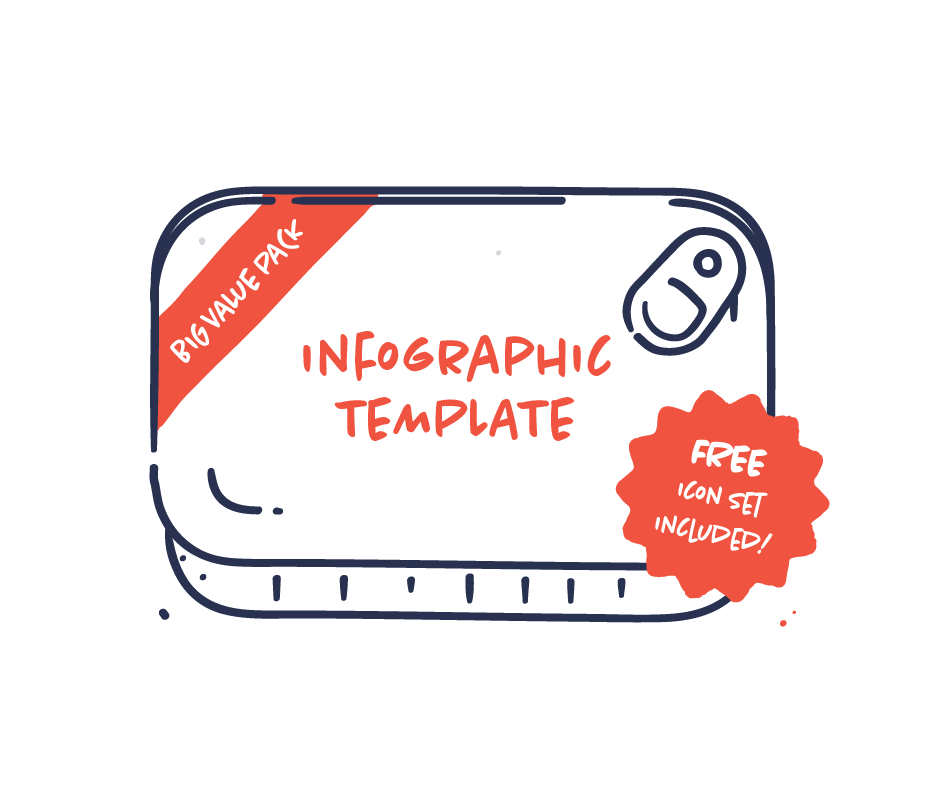
Templates are infographic junk food
Infographic templates might be tempting. They are fast, easy and cheap. But truth is that they will rarely solve your communication challenge. Templates are generic both in input and in output. They are too rigid, limiting and will often dictate what and how you communicate. Our advice is: stay away from templates.
Data is imperfect
Let’s just stop thinking data is perfect. Data is primarily human-made. “Data-driven” doesn’t mean “unmistakably true,” and it never did. That’s why working with data and communication data requires an even greater sense of responsibility. Treat data with respect and remember that it’s not perfect.
Put numbers in context. Always.
Data without context leaves the reader wondering. Is it a high number? Is it low? Good? Bad? The context will tell your audience whether the sales figures shown should be perceived in a positive or negative light. Everything’s relative, so we always need some kind of context in order to understand a number.
Love your spreadsheets
Don’t be afraid of the spreadsheet. It can be just as much of a playground as your Adobe Suite. This is where you find patterns, organize your content and discover great stories. You might not be a data analyst, but data curiosity and an analytic way of thinking are key when it comes to creating great information design.