The Notebook
on Infographics
Hard-earned insights from our notebook
about infographics and information design.
Hands-on, honest and condensed.
You are not looking close enough
In information design, the devil is in the detail. Small inaccuracies might make your designs completely misleading and impossible to decode. Have a closer look at your work. Your icons might be inaccurate, the scale of the graph misleading or the text might not match the visual. All details matter when you want to communicate clearly, effectively and convincingly. So have a closer look, be critical, adjust and refine.

Cut the crap
Crap is the unnecessary information and visual assets we start to add unconsciously because we think it is needed or because we are scared of simplicity. You fail to notice that your visual content is beginning to include a lot of superfluous crap. Don’t be afraid of simplicity or white space. Just cut the crap and get rid of everything that does not seem to help the main purpose of the infographic.

Above all, be trustworthy
Your audience must rely on your information and trust that it is credible.Trustworthiness and authority should be present in your sources, your data, your visualizations and your design. Treat your data and sources with respect. Don’t be cocky, frivolous or too simplistic, as it will make your data visualization lose authority and trustworthiness.

Check readability!
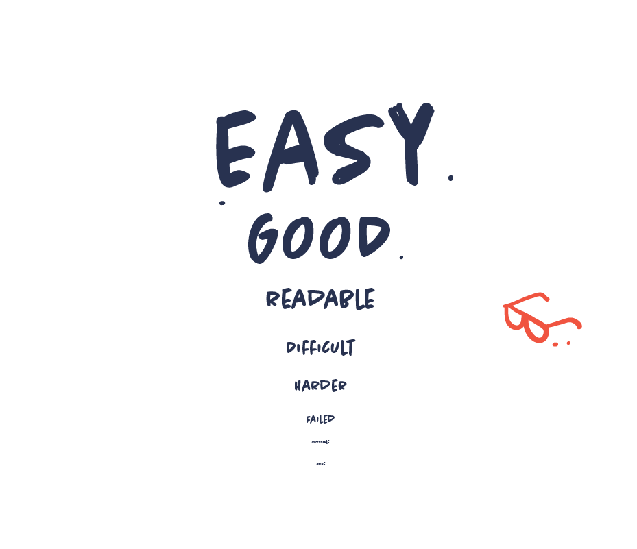
It should be obvious. But readability is a major concern in information design. And we often fail at this because we have not considered the context or the format or we fail because we value aesthetics over function. Perhaps the font size is not big enough or the contrast is too vague. So make sure that the text is not just readable but also pleasant to read in any given context. Whether it is on a mobile phone or in a social media feed and remember to test it.

Make your infographic stand out visually
Your content has to compete with thousands of other pieces of content online. So your content will easily fail if it’s anonymous or generic. That’s why your content needs to stand out visually and be remarkable. You want your visuals to make an impression and be remembered in order make an impact.

Balance the rational with the emotional
Though information design may be based on cold numbers and facts, it shouldn’t be dry. In fact, it needs to evoke emotions in order to resonate with an audience.
The best information design strikes a balance between the rational information that needs to be conveyed and the emotional attachment an audience has to the visual depiction.

Don’t design for designers. Design for people.
Some designers tend to create designs that other designers will appreciate and applaud or design with their own taste and preferences in mind. With this approach your design risks being exclusive and, in the worst case scenario, disliked or misunderstood. Target your design for your main audience, who are most likely non-designers. Understand what works and appeals to your audience and ignore your designer friends.

