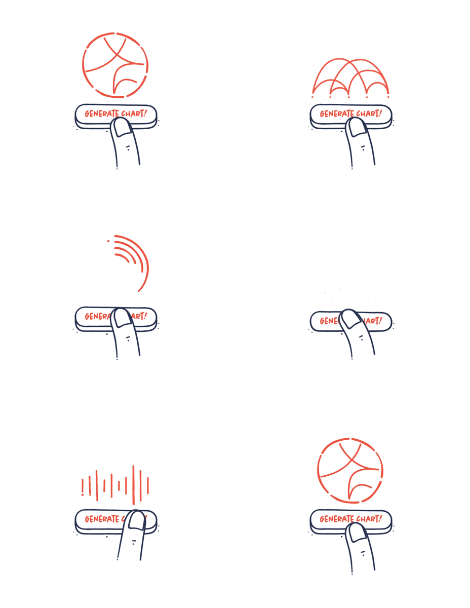
Your tools should not decide what your visual should look like
In recent years, we have been flooded with amazing new data visualization tools. It is easier than ever before to exploit these tools. They are often used to make advanced and heavy data viz that would have been almost impossible to make before. But just because it is possible, doesn’t mean that it’s a good idea. The story you want to tell should decide how you visualize your data not your tools. The visualization should underline your story and not be more complex than necessary to communicate the message.

